✔️ Reviews
Reviews are a new way to (you guessed it) review work in Hex! You can make reviews required to publish changes for certain projects, or just ask for a review anytime you want a second pair of eyes.
Peer reviews are the best way to keep business-critical reports from breaking, avoid accidental data mishaps, and build institutional knowledge on your data team. But analytics tools were never really built for it, and though some teams have found success in git-based workflows, it’s always a hassle to review work out-of-context— especially complex visual reports with lots of charts.
Reviews bring the full code review workflow right into Hex, making it delightful to review even your most complex data projects.
A rich diff view lets you easily see the code, config, and data changes to every cell in the notebook, and integrated app previews mean you can click-test everything without switching contexts.
Reviews also ship with overall updates to the publishing workflow: an improved diff view, overall polish, and… drumroll please… notebook editors can now instantly compare their current draft to the published version 😎.
Reviews are available for workspaces on our Team & Enterprise plans. Learn more in the docs.
👁️ Data Browser Improvements
The Data Browser now features full table previews, new ‘Recently Used’ and ‘Favorites’ tabs, and a full-screen view. We’ve also added more ways to access it in addition to the sidebar: from the ‘Add cell’ bar as well as the blank state of new projects.
We saw that everyone, including our own data team, started every analysis by running a couple select * from table limit 100; queries to get the lay of the land.
Table previews in the Data Browser replace that clunky workflow! You’ll find your most commonly referenced tables in the Recently Used or Favorites tab, with an instantly available 100-row preview right alongside metadata from dbt and the Data Manager.
One more click, and you can add a SQL cell with a pre-filled query to your notebook.
PS: We used to call this the “Schema Browser”. Did you ever wonder why we changed it to “Data Browser”? Now you know— because we were planning to put actual data in it!
📈 Chart Cornucopia
We want building charts in Hex to be the best visualization experience you’ve had since your last ayahuasca retreat. To that end, we’ve been investing a lot in both new features and careful polish to our chart cells— like the “Chart fixes galore” release from a few weeks ago, or the recent Facets release.
This round of updates includes some really impactful additions, and there’s way more where they came from. So if there’s something nagging at you that would make charts in Hex more useful for you, please let us know, and we'll get on it!
Total labels
You can now add total labels to stacked bar/column charts that sum up the entire bar. This is best used in tandem with a group / color by field, so you can view two levels of aggregation in one visualization.
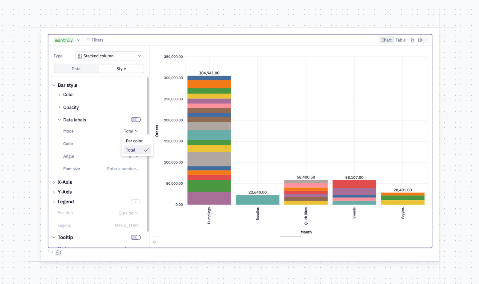
This was actually our second most popular feature feature request! Pro tip: If you use this in combination with manual tooltips, you’ll be able to view even more distinct levels of aggregation in one visualization.
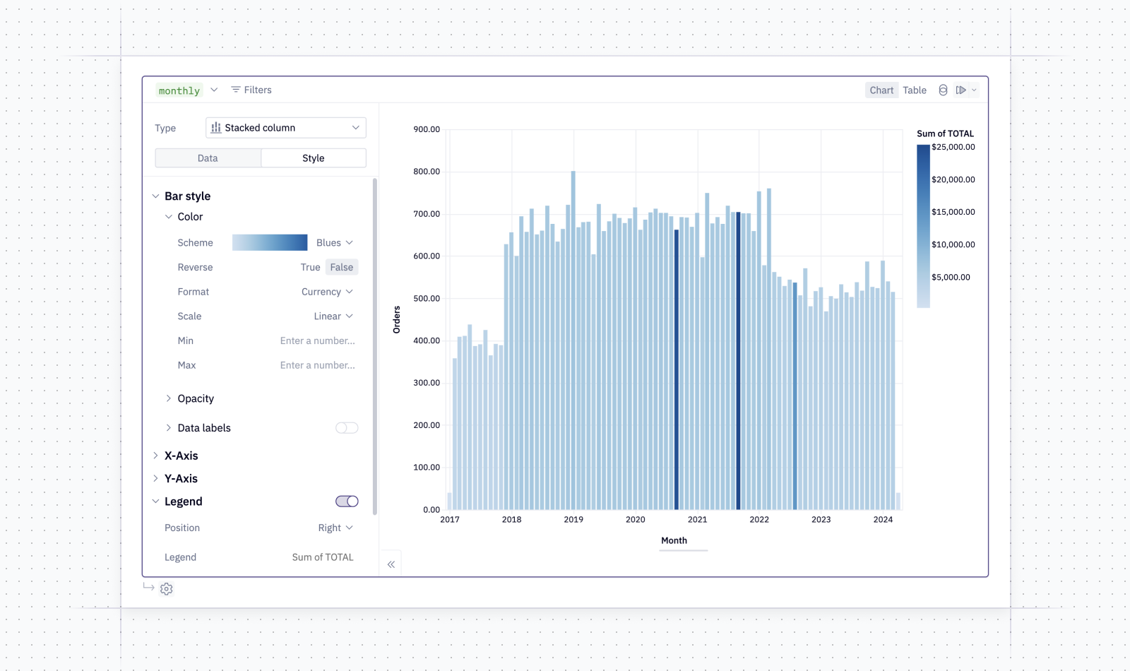
Continuous color improvements We’ve made improvements to continuous color scales, from the color swatch / pane selector to improved scaling and bounds.
Just like facets, continuous color scales can be surprisingly useful for visualizing an entire new dimension of your data that’s otherwise difficult to get a sense of.
In this example, I’m using a continuous color scale on total order revenue to highlight an interesting seasonal revenue trend that doesn’t seem to correlate with order count. That seems worth digging into further…
Independent y-axes for facets
You can now detach the y-axes of facet charts to allow each individual subplot to have its own auto-sized y-axis. This can be a valuable tool for comparing distributions, but please use this carefully to avoid chart crimes!
This email has run out of megabytes for images, so you’ll have to imagine this one. It looks spectacular, though.
Config overwriting polish
Previously, you might have find yourself a bit peeved when changing a field selection in one part of the chart config resulted in you losing your settings in another part of the config. We’ve improved the way that defaults are handled to prevent them from ever stepping on your toes and overwriting your choices.
And more…
We've improved log scale bounds-handling, improved the stability of facets and fixed error messages when that fails, improved various warning messages, and cleaned up selection menus.
Other improvements
- Shared drives are now supported in the Google Drive external file integration.
- We’ve made some updates to the new homepage view, improving the visual layout of Recently Viewed cards in particular.
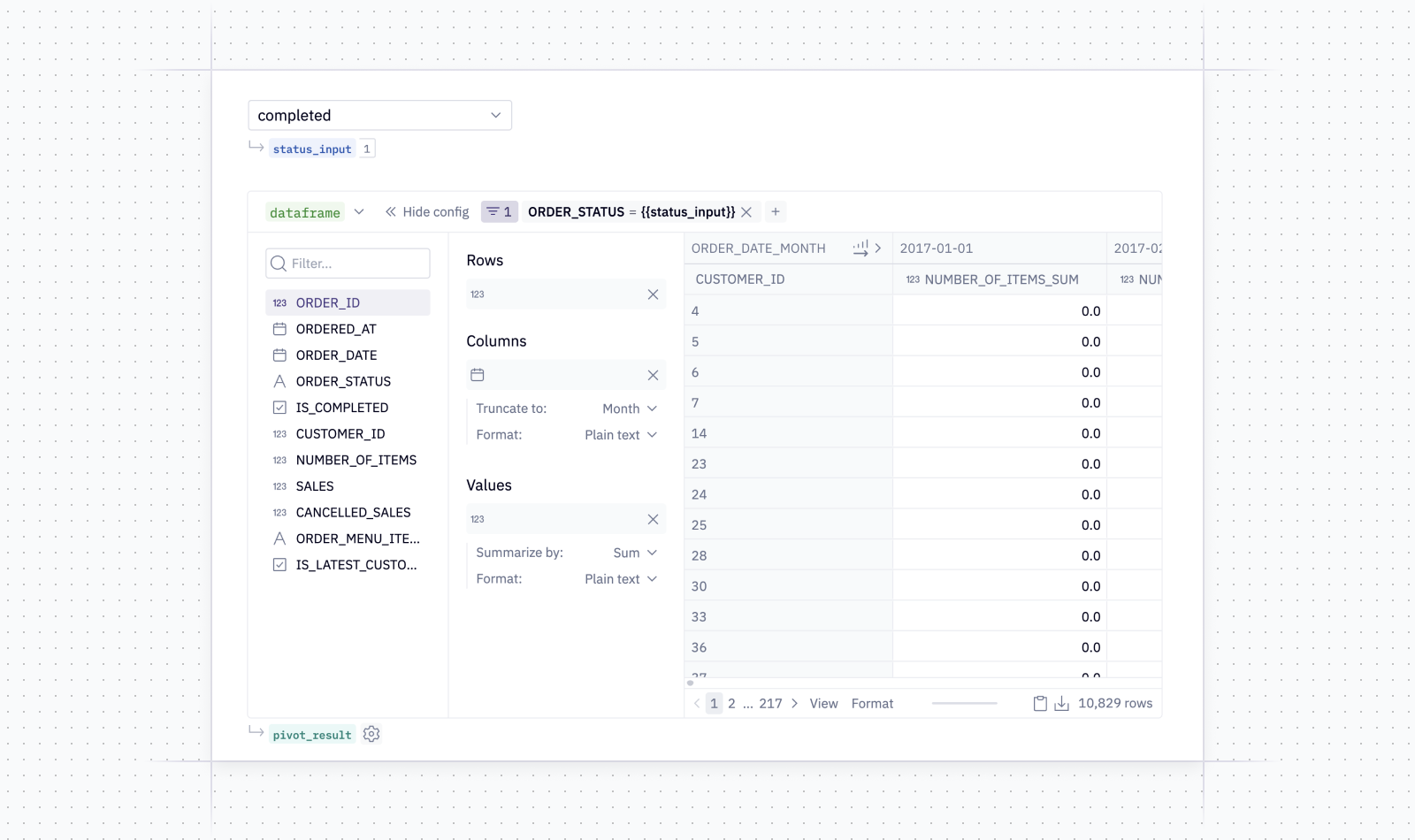
- We fixed a bug that prevented using jinja to parameterize a filter on a pivot cell. Did you know you could do that?! I sure didn’t. Well, I guess you couldn’t. But you were supposed to. And now you can.