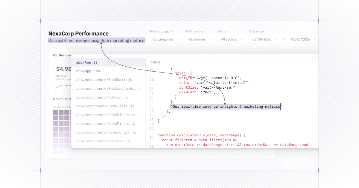
✏️ Edit generative app code in Hex
Sometimes you don't need the agent, you just need to change one line. Previously, you had to prompt the agent every time you wanted to make a simple fix. Now, generative apps can open in a real code editor right inside Hex, so when you want to change a label, adjust some styling, or fix a bit of logic, you can just do it.
Your edits sync live and save as you go. The agent still manages the app manifest behind the scenes, so the file stays read-only.
Open any generative app, switch into Code view, and pick a file from the sidebar to start editing.
⬇️ CSV downloads for every chart and table
Charts and tables in generative apps can now export to CSV, so the people looking at your app can pull the numbers behind it without coming to you for the raw data.
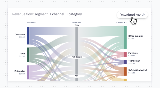
The download gives viewers exactly what they're looking at, with current filters, sorting, and search carried through. It respects your workspace's download setting, so if an admin has downloads off the button never appears, and every download is audit-logged. Dates come out as clean ISO timestamps, so they land correctly in whatever tool someone opens next.
New charts and tables get it automatically. But for an app you’ve already built, just tell the agent: "Add Download CSV to the charts and tables in this app."
🔔 Desktop notifications for the agent
The Hex Agent can now send a desktop notification when it finishes a run or needs a decision from you, so you can fire off a prompt, go work on something else, and get pulled back the moment the agent needs you.
It only pings when you've switched away from the thread, so if you're watching it, nothing pops up. Kick off your next agent run and accept the prompt when it appears, or turn it on anytime in personal settings under Notifications.
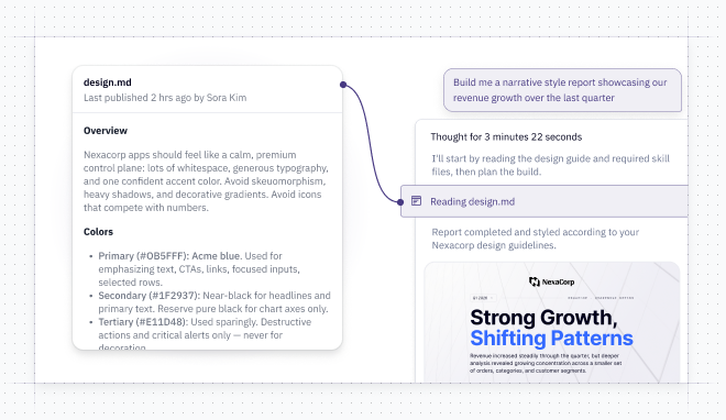
📸 The agent can see the apps it builds
The Hex Agent can now take a full-page screenshot of a generative app as it builds, and zoom in on a single chart or view, so it can check its own work and fix what looks off before handing it back to you.
You won't touch this one directly, you'll just notice apps come out looking right more often.