Data is most powerful when the whole org can use it, and when every person who uses it makes it better for the next. Every query, every metric, every insight should feed back into the platform and make the next person's work faster, more accurate, and easier to trust.
We've been calling the stuff that usually slips through the cracks context exhaust: the query you ran to get there, the project someone built six months ago that answered this exact question, the metric definition your team actually agrees on. It just kind of evaporates. Today's release (and basically everything else we’re doing) is about capturing it and putting it to work.
We're also making the agent itself more capable: specialized subagents that handle complexity in parallel, Python in Threads, smarter data discovery. The kind of thing that means your best analyst's instincts aren't locked behind a queue.
The more your team uses Hex, the better it gets. Here's what's new.
📽️ Project context for the Hex Agent
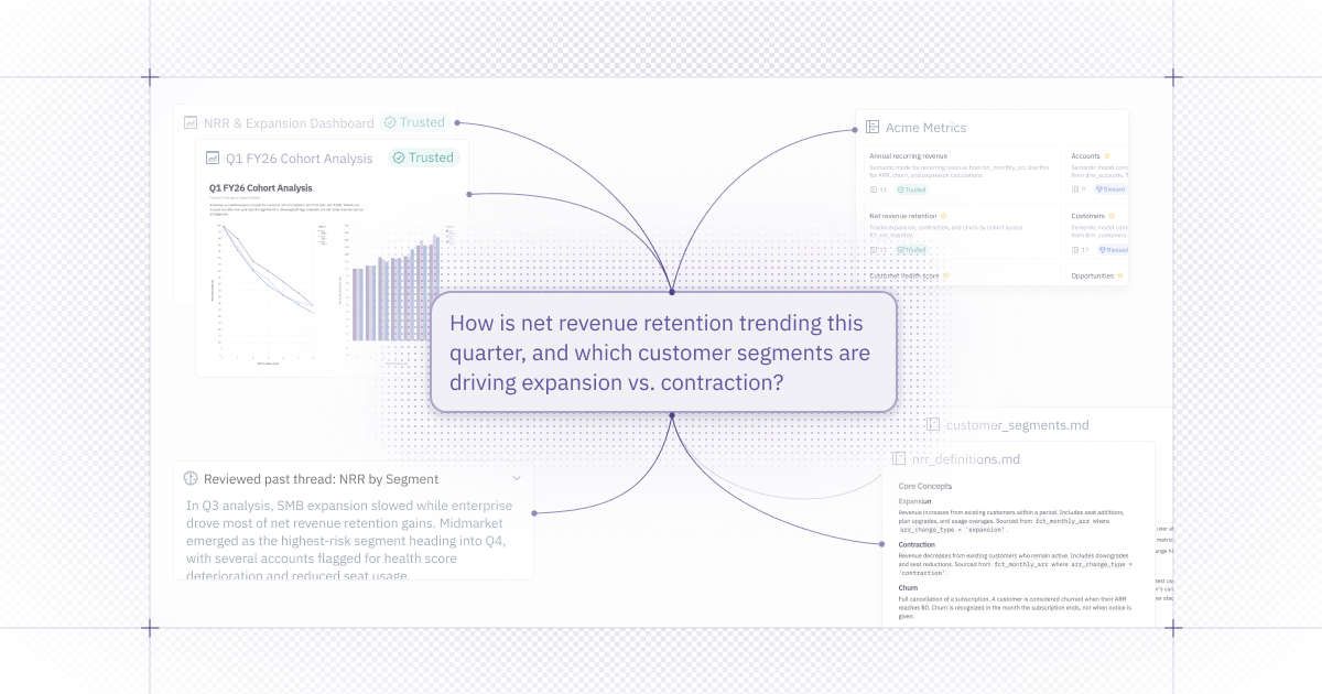
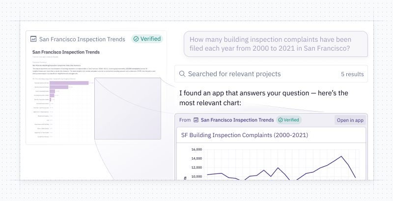
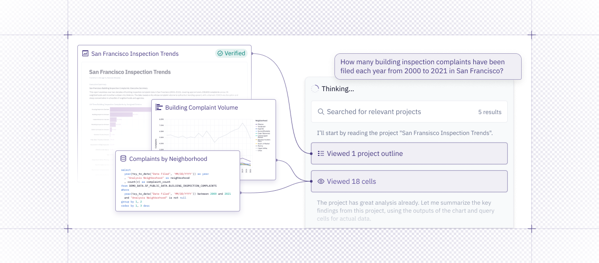
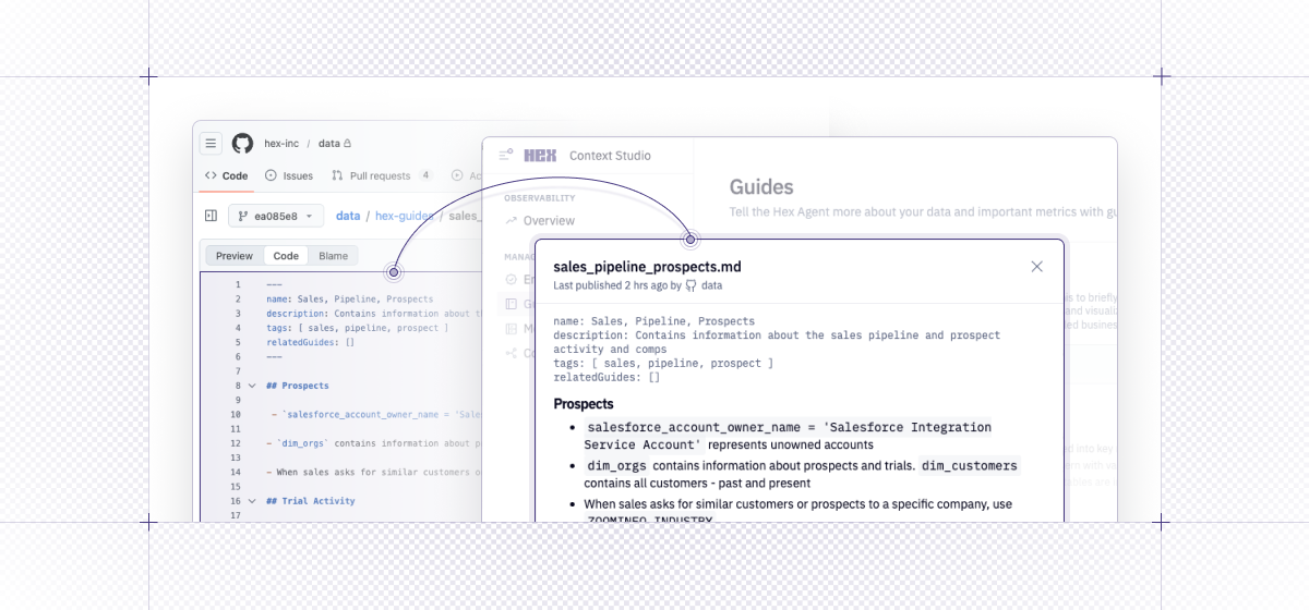
The agent can now deeply reference other projects. This helps you take advantage of the work other analysts have done, ensuring trusted answers and consistent metric definitions.
- In Threads - The agent can now pull queries, charts, and code from your projects into a thread.
- In a Notebook - Start with an existing project and use it as a jumping off point for a deeper investigation.
- In Workspace context - Projects can now be referenced in your workspace context and guides as examples the agent should review before giving an answer.
Simply @ mention the project you want to refer to (or paste in a link) if you have a specific reference in mind. You can also tell the agent to search for all projects related to [a topic that interests you].
If you’re creating projects in Hex already, you’ve already built a ton of context that can direct our agents. Be sure users have "Can explore" access to important projects in order for them to be pulled in as context in Threads.
For more details on how this works, check out our blog.
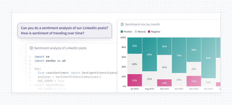
👨💼 Threads Agent can use Python
Previously, when you were in Threads, the Hex Agent could only create SQL cells and charts. We’ve given Threads the ability to write Python! This opens up the possibility of all sorts of new conversations in Threads, like asking the agent to create a forecast of a metric that interests you, bringing in sentiment libraries, and letting the data visualization subagent create more customizable charts. Since Threads can now bring in cells from other projects, you can even take advantage of code written by your data science team and run it in your Thread.
🔎 Focused Cell Viewer in Threads
We’ve built a new cell-viewer in Threads. As Threads generates cells, you can click into them and see the results. There’s a nice, clean UX for flipping through charts and code cells and a nice big viewer for your pretty charts. While in focus view, you can link anyone to a cell directly. When the agent is done, you’re left with a simple, browsable summary of all the steps the agent went through and outputs it made.
Wouldn’t it be nice if you could publish this summary as a shareable app of some kind? 🤔 Stay tuned.
↔ Agent can swap data connections
Previously in Threads, the user had to select a data connection before sending a message and the agent was restricted to that connection. Now, when you’re asking the Hex agent for answers from your collaboration or prompting tool, it has the freedom to find any data in your workspace.
This is especially useful in Slack and MCP - which were previously restricted to the workspace’s default connection.
We’ve also heard from folks that they are a little worried that this might result in the Slack bot leaking or posting sensitive information into public channels. Fear not - we’ve also added a setting to let admins specify which data connections can be used by the agent in Slack.
🚊 Improved data discovery and visualization with subagents
A hard data question isn't really one question. The Hex Agent can now break complex requests into focused workstreams using subagents - specialized helpers that each tackle a discrete part of an analysis in parallel that can effectively handle far more without hitting context window limits. The result is faster, more reliable answers without you having to change how you work.
The Data Discovery Subagent finds the right data connections, tables, and schemas before analysis even starts. This is particularly helpful for questions where you may want the agent to search through a complex warehouse setup.
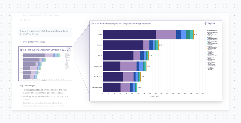
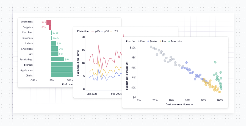
The Data Visualization Subagent handles your charts end-to-end - choosing the right chart type, configuring axes and labels, and applying visual best practices - so you can stay focused on the analysis itself. Here are some nice charts the subagent has made:
🛠️ Other improvements
-
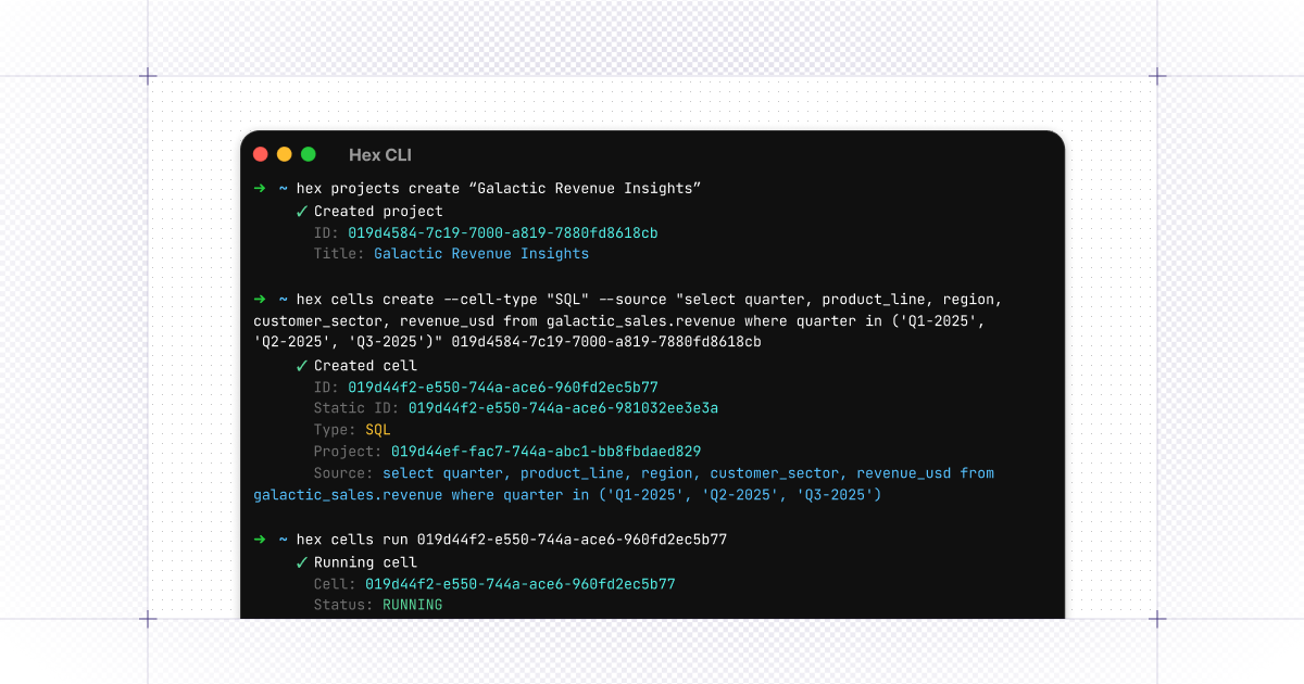
Hex CLI Open Beta - If you’re analyzing data using a coding assistant like Claude Code or Cursor or managing Hex projects in bulk, you can try out our command line tool to incorporate Hex into your code-based workflows. We’re still working on the CLI, but we’re excited to get people using it and to hear your feedback!
Docs are available here, or just copy paste the shell installer:
brew install hex-inc/hex-cli/hex
-
Queue Prompts in Threads - Threads now has the same prompt queuing feature we added to the notebook agent a couple weeks ago. Want to correct the agent’s thinking? Or did you just forget something? Queue up your thoughts and have the agent pick them up when it’s finished with its current task.
-
Attach charts to notifications - When scheduling a notification now you can attach specific charts to your notification instead of the recipient hunting through a big graphic to find the chart that matters to them. We've been sending pretty graphs in Slack and the team loves it!
-
Run status and project metadata in one place — We’ve consolidated run and kernel info into the Run button at the top of Logic view—hover for status, memory, and environment details.