Whether you’re in Hex, using a spreadsheet, or collaborating with your colleagues, data should be there providing useful, relevant updates. Today, we’re excited to share an easy Google Sheets integration, a Cursor plugin, and the ability to bring more real-world context into your prompts by allowing the Hex Agent to accept text and image uploads. Lastly, check out the nice new streaming UX update for the agent.
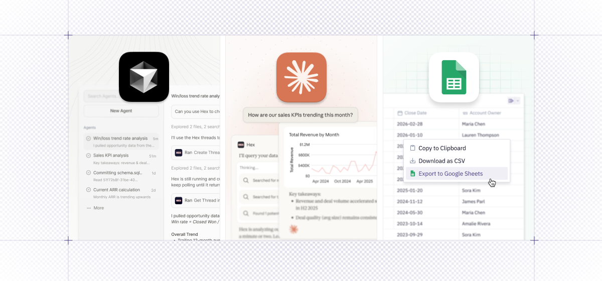
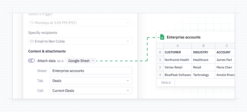
📄 Google Sheets export
You can now export to a Google Sheet in one click from cells or schedule your app to export to a Google Sheet. This is especially awesome for finance teams who want the power of the agent in Hex, but still want to easily work in a full spreadsheet view at other times. Notifications hit your inbox or Slack with a link to the spreadsheet as well as the Hex app.
🖼️ Hex Agent now accepts text and image file uploads
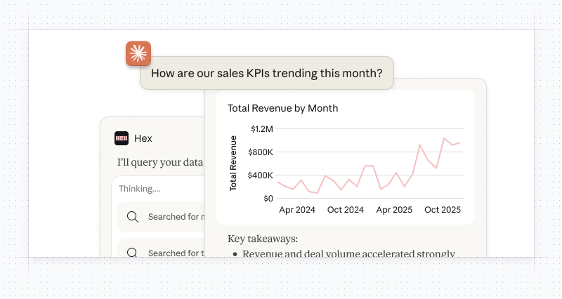
Users can now upload and attach text and image files to their prompts. Inspired by a chart you like and want the agent to help you make something similar? Just upload a screenshot. You can even use an image to help bootstrap an entire dashboard.
Curious about Hex’s AI capabilities but struggling with how to get started? Check out our learn docs - where we’ve curated a handy set of best practices for setting up and prompting our agents.
🧠 Interactive charts, tables, and thinking steps directly in Claude
Our Claude Connector is now enhanced, with a native app, interactive custom-styled charts, tables and thinking steps.
When you fire off a data question from Claude, the Hex connector will spin up an interactive interface displaying the Hex agent’s thinking. Click into the steps to see which tables or semantic models the agent is referencing, and to spot-check the underlying SQL. This lets you follow the agent’s reasoning, deepen your own understanding, and point things in a new direction if needed.
Ready to dive in? Check out the Hex Connector in Claude’s directory and our documentation.
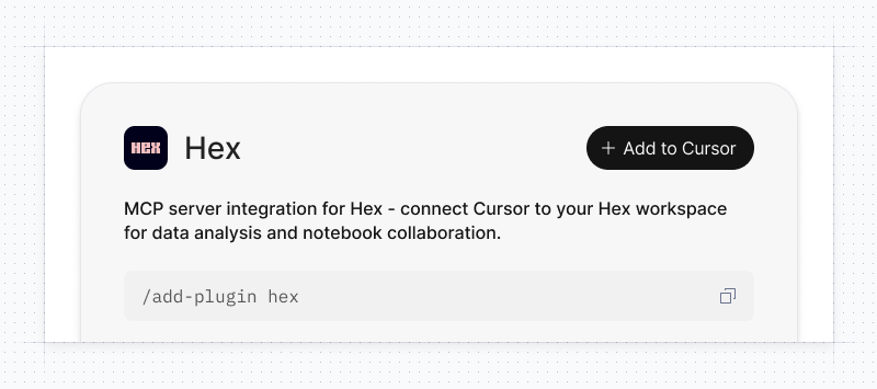
👾 Cursor Marketplace plugin
Software engineers and vibe coders, rejoice! Hex is now a plugin on Cursor's Marketplace. You can search for Hex projects and create and interact with Threads while you code. For instructions on how to connect Hex and Cursor, check out our docs.
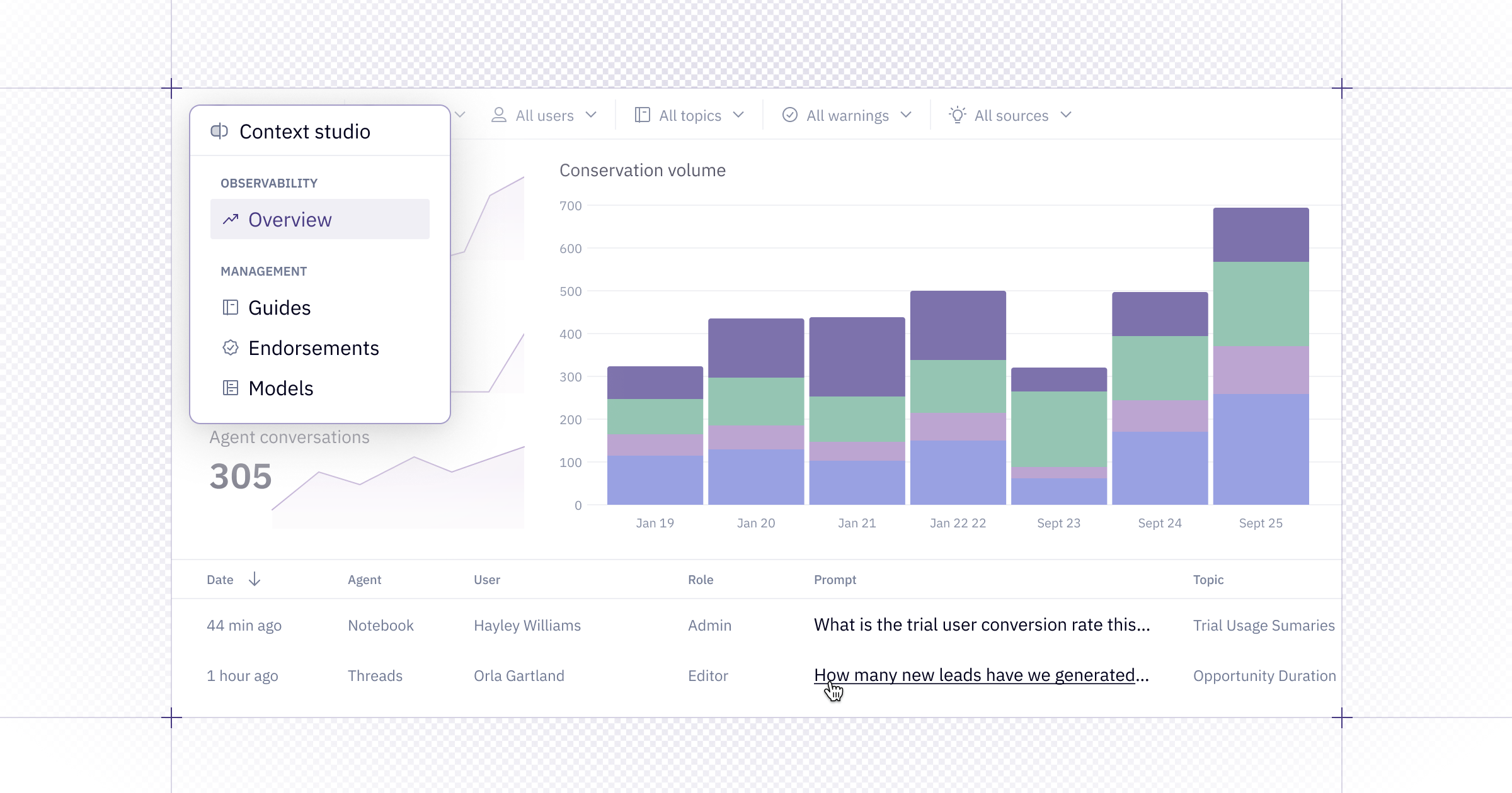
🕵 Two cool UX improvements for the Agent
We also have two nice new quality-of-life improvements for those of you who love working with the Hex Agent, but hate waiting.
- Agent Streaming - This UX tweak allows you to get your agent responses faster! No more waiting for the agent to be done with every step in the analysis. Read it in real time.
- Prompt Queuing - Now, in the Notebook, you can queue up new prompts for the agent. When you enter a prompt when the agent is running, it’ll go into a queue to run right after the current prompt is done. Realized the agent is going off track, or want to nudge it down a different path? Easy. Create a whole queue of prompts. We’ll bring this capability to Threads too, coming soon!
See both of these upgrades in action below: