We’ve shipped a lot of big features lately: the Notebook Agent, Threads, the Modeling Workbench, Explore capabilities, and more. This week’s updates are all about enhancing these agentic workflows in Hex, and doubling down on the semantic context and curation tools needed to make AI accurate and useful in your analysis.
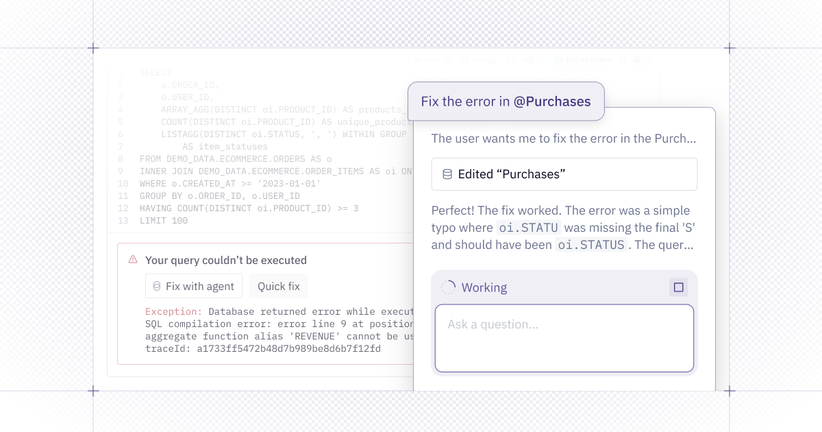
🧰 Fix with agent
Debugging code and SQL is tedious, especially when you’re working with a new, unfamiliar dataset. The Notebook Agent can now help!
From an errored Python or SQL cell, you can now Fix with agent. Instead of being limited to looking at one cell and only editing the contents in that cell, the Notebook Agent has full project context and can view/edit upstream cells and compiled SQL.
“Quick fix” is still great for simple syntax errors that are constrained to a single cell, but “Fix with agent” can handle more complex errors that may require changes across multiple cells. You might even find that its explanations help level up your SQL and Python skills!
🤖 Notebook Agent improvements
We’ve been very busy making our Notebook Agent smarter, faster, and more efficient in Hex. Here’s everything we’ve shipped lately:
- Powered by Claude Sonnet 4.5: The Notebook Agent and Threads are now running on Anthropic's latest model, with significant improvements in speed, capability, and complex task handling for analytics tasks.
- Using Hex docs: The Notebook Agent and Modeling Agent can now leverage all the technical documentation on our Learn site in its answers, and point you to relevant tutorials and templates. The next time you have a question about Hex’s features, just ask the agent!
- Implemented Notebook DAG context awareness, so the agent can make more intelligent, dependency-aware decisions about editing
- Better at handling long-running cells that do heavy queries and analysis
- More careful about editing vs. creating new cells for a tidier notebook
- Better at telling you if it doesn’t have a tool to fulfill a request — like input cells, moving cells or deleting cells. (But good news! These are all tools that are coming 🔜)
- Radically improved ability to write and edit jinja
- Agent can now run for twice as long without checking in, and is also much more reliable about stopping early and not wasting time
- Better at recognizing when a user has a quick question vs. a vague problem that needs alignment, in which case it’s better at checking in to coordinate on a plan rather than just diving headlong into doing things
- Prefers chained SQL to write clean, easier to read SQL
- Improved usage of Hex charts for nicer interactive visualizations
- Generally improved response tone to be more concise, higher signal and less fluffy
- Reduced creation of markdown or Python summary cells, unless explicitly requested
- Better understanding of components and sections, and correctly placing cells in the notebook
The agent should feel much more intelligent with all these improvements! We’d love to continue to hear your feedback on all this — just drop us a note.
🧵 Threads improvements
Earlier this month, we launched Threads — a conversational interface for everyone to answer questions with data — and the feedback has been awesome to see!
Since then, we’ve made some improvements to make the Threads experience even more delightful:
- Readiness indicator in browser tabs: Let Threads work in the background while you grab a coffee or respond to an email. When the agent is finished thinking, you’ll see an indicator in the title of your browser tab, so you can jump back in when results are ready.
- Duplicating threads: Pick up where your coworker’s conversation left off by making a copy of a thread that has been shared with you. The prompt history and previous results will remain upstream for you to reference.
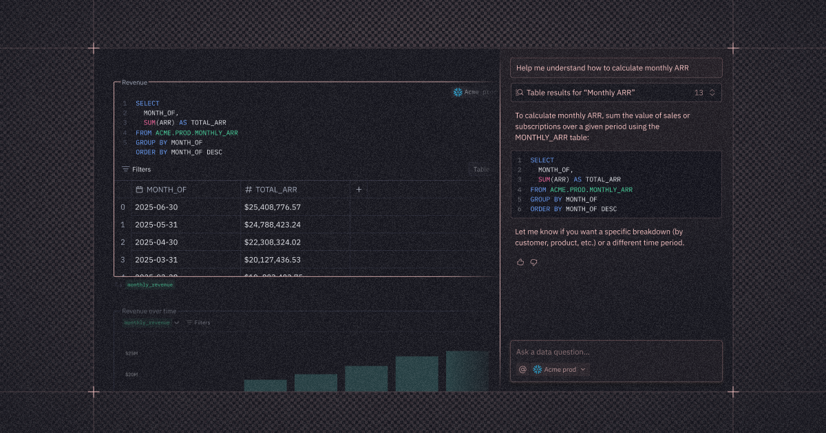
- @-mention data sources: When you want the Threads agent to use a particular semantic model or warehouse table to answer your question, you can specify a data source with an @ in your prompt.
Please keep the feedback coming, and let us know what you’d like to see next!
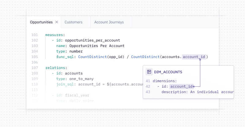
🧱 Databricks Metric Views integration
Last year, we introduced Semantic Sync in Hex, enabling teams to turn on trusted self-serve via pre-existing semantic models.
We’ve now added support for Databricks Unity Catalog Metric Views — in addition to syncing with dbt MetricFlow, Cube, and Snowflake Semantic Views. You can now:
- Browse metric views directly from your Databricks connection in Hex.
- Query with SQL in the notebook, without redefining metrics.
- Build data apps that are backed by governed metrics, ensuring consistency from exploring to publishing.
Whether you choose to sync external models or build them natively in Hex’s modeling workbench, these trusted measures, dimensions, and business logic allow the Notebook Agent and Threads to generate more consistent, accurate results.
Read more in our announcement of Hex’s Databricks Metric Views integration.
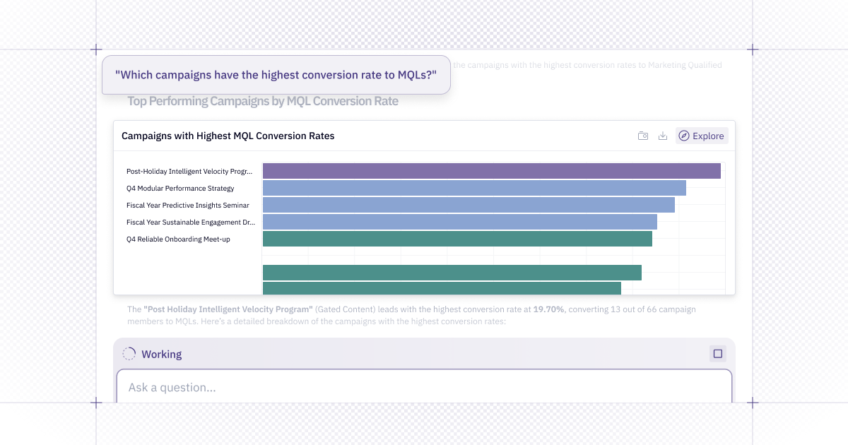
🔝 Top N and more Explore improvements
Explore continues to grow even more powerful and feature-rich as we add more capabilities for digging into data and building visualizations. The latest addition to Explore’s toolkit is Top N, which helps you answer questions like “Who are our top 10 revenue-generating customers?” without requiring a line of code.
Top N allows you to specify the top (or bottom!) n values for a dimension in a chart or pivot, and choose whether the “other��” values are bucketed in the viz.
This is only one of many improvements to Explore over the last six months, so we compiled a round-up of what’s new in Explore (e.g., totals in pivots, aggregate calcs, drilling, and more)!
🧭 New navigation sidebar
With how much the Hex platform has changed and grown over the last year, it was time to refresh our sidebar for consistent, intuitive navigation!
Lean on the nav sidebar as your go-to hub for creating and engaging with assets:
- Start a new project or thread
- Jump back into recent work, and find favorites
- Search your workspace
- Respond to notifications (all in one place!)
- Access Settings or Support
It's available from any page in Hex, so folks who are new to your workspace will have an easier time finding their way around. (And our new homepage is a great jumping-off point with a big ol’ prompt bar for asking the agent a question!)
Other improvements
- Subtotals and sort by values in pivots: In addition to totals, it’s now possible to add subtotals to pivots that have multiple rows or columns. You can now sort by aggregated values in pivot tables.
- SSH tunneling for Databricks: Our Databricks data connector now supports SSH tunneling for secure connections to databases behind firewalls or in private networks.
- Custom data retention periods: Admins can now tailor data retention timelines to meet stricter compliance requirements and internal policies. This custom data retention is available for cell outputs and cached warehouse data of 7, 14, 30, 60, or 90 days.
- Version history in Modeling Workbench: Now you can see a history of changes made to a semantic model and who made those changes. This includes checkpoints created before the Modeling Agent makes a change.
- Project filters can reference semantic model columns: Project filters are now hooked up to semantic models, so you can build a fully no-code, interactive app based on modeled data.
- Support for semi-additive measures: Hex's semantic modeling now supports measures on snapshot tables. These semi-additive measures allow you to control which dimensions measures can be aggregated over. They automatically subselect the correct rows, such as only using the latest month of data.
- Manager role can edit semantic projects: After an Admin creates a semantic project, Managers can now edit them — broadening the pool of folks who can work on semantic models without giving out full Admin access.