There’s two main feedback loops that data folks spend most of their time in:
The core analytical feedback loop: ask question of data -> improve understanding -> ask a better question -> repeat until satisfied.
The stakeholder feedback loop: stakeholder asks question -> data team builds report to answer it -> stakeholder requests changes → repeat until satisfied.
Almost every feature we add to Hex aims to make those feedback loops quicker and more delightful. Today, we’re making some big improvements to chart cells that make both these feedback loops way faster!
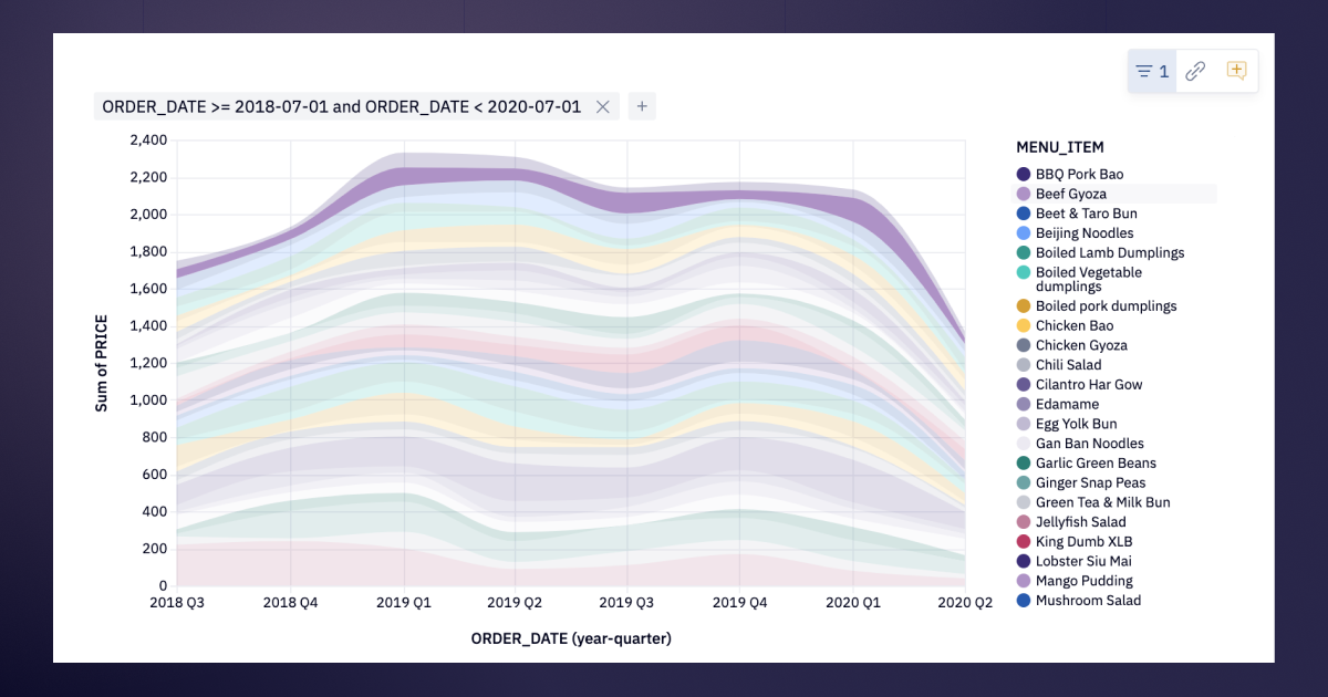
🌀 Filter charts by… filtering in charts!
Chart cells in Hex are now fully interactive, both in the Notebook view and in published apps.
Hover over a chart legend to highlight a series. Click the legend, or click and drag directly on the chart to select data. Then choose to keep or remove your selection to filter the chart.
How does this improve the core analytical feedback loop?
Working on an analysis in Notebook view, you can rapidly iterate and explore data visually without rewriting SQL or running new queries. You can also use the filtered data in downstream cells to see different dimensions of the data with just one quick brush gesture.
How does this improve the stakeholder feedback loop?
Viewers of published apps can customize and drill into specific aspects of reports to answer their questions without having to ask for help from the data team. No more “this looks great, but can you also make a version with just the last 30 days?”
Depending on how you set up your app on the backend, you can give end users a ton of interactive latitude in reports:
Sharp-eyed users will recognize that an opt-in version of this has existed for a couple of months, under the moniker “Visual filtering”. We’ve taken the foundation of visual filtering, improved on it, and enabled it by default with this release. You can find information on the specific differences in the docs.
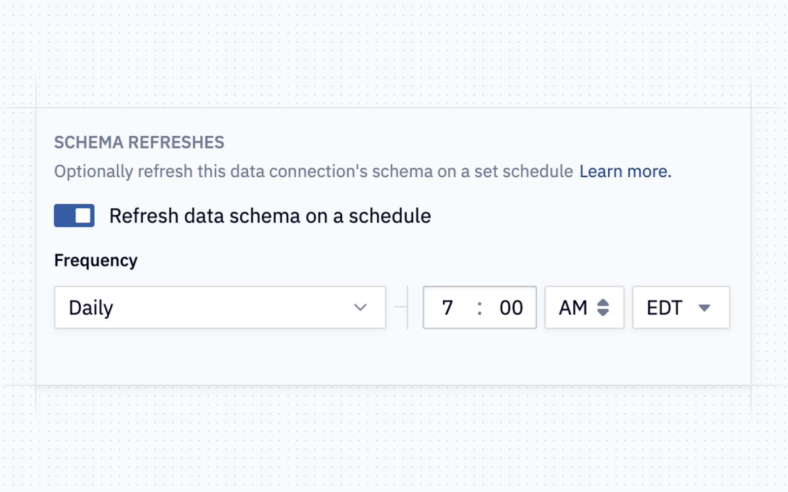
⌛ Scheduled schema browser refreshes
You can now refresh the schema browser’s metadata for any data connection on a schedule. Pro tip: schedule this for after hours so that by the time you sit down at your computer to write some world changing SQL, you’ve got up to date metadata at your fingertips.
📊 More chart improvements!
While we were making our chart legends interactive, we also fixed some UX issues with them. Series names that truncate too early, or entries that scroll off the page are a thing of the past Legendary.
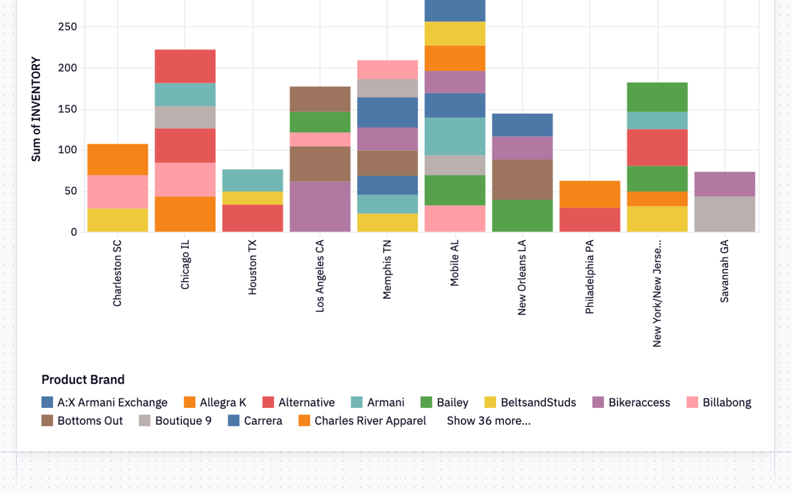
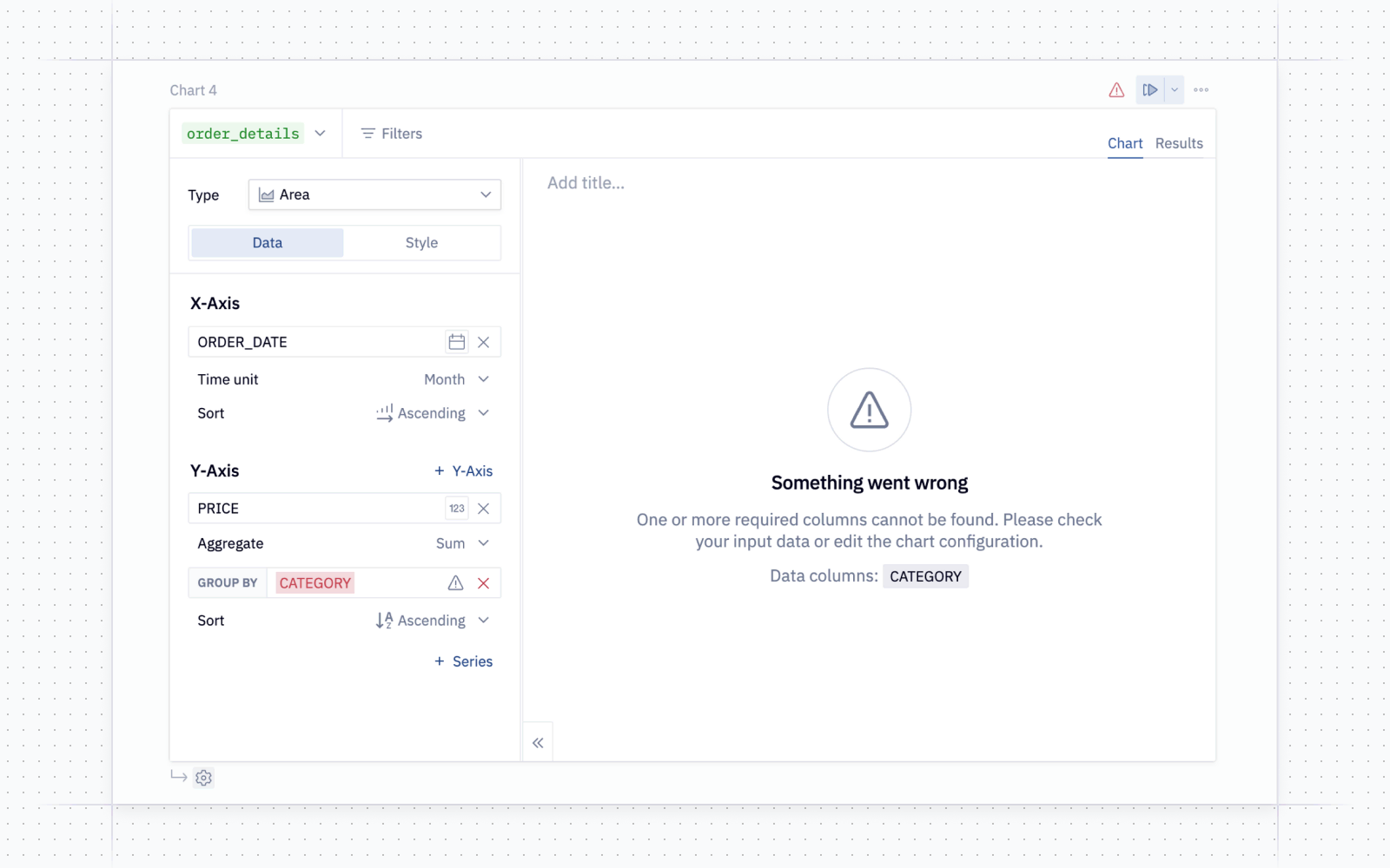
Chart cells have more helpful error states: if a column that was being used in a chart is removed from your dataframe, we’ll let you know that the column no longer exists rather than printing a gobbledygook error. Even if you swap dataframes entirely, we’ll try to preserve as much of your chart configuration as possible.
And one more fix for chart cells: charts that have more than 20 series in the legend now have a more useful tooltip! Since we can’t fit all 20 series in the tooltip, we’ll show you the closest series value to your cursor 😮💨.
💫 Hex Magic now incorporates dbt Metadata
If you’re using the dbt Cloud metadata integration, we now use the descriptions from your dbt project to help generate better Magic responses.
If you haven’t enabled this yet, you can configure the dbt integration by adding the details directly on your data connection, from the Data sources page of the admin panel.
⚡ New connector: Starburst
We now have a dedicated connector for Starburst, for those of you living that lake life.
Other improvements
-
We fixed a bug that meant the font sometimes changed as you were typing code. One of those bugs where once you saw it, you couldn’t unsee it. Well, until now, cause we just fixed it. So you won’t ever see it again. Is that the same thing as unseeing?
-
When setting up a scheduled run, we’ve added a handy little “Test scheduled run button” so you don’t have to wait until your next run to see what it looks like