We’re kicking off Big Data Summer with highly-requested updates that will speed up your analytical workflows and allow you to customize Hex in small-but-mighty ways. Let’s get into it. 😎
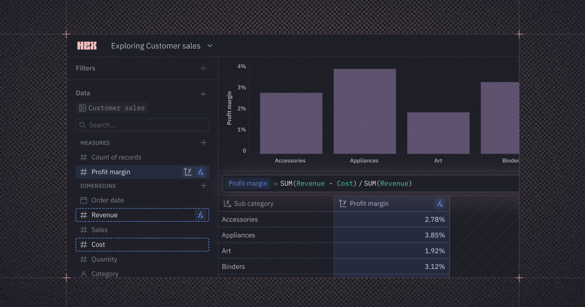
🧮 Aggregate calculations
Want to define a ratio of sums? A weighted average? Or some other custom measure to use in charts and pivots?
Editors and Explorers can now use Hex's Excel-inspired calculation language to define dynamic aggregations within explorations and Explore cells.
These aggregations automatically update based on how you group your data — without using any SQL or Python. And since explorations show the row-level data behind the calcs, your teammates can easily jump in and build on your work.
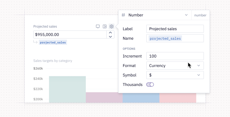
🔢 Formatting for numeric input parameters
You can now format numeric input parameters as a percentage or currency, limit the number of decimal places, and add commas using the thousands separators.
The input parameter’s output is still a plain numeric value under the hood — this feature just makes numbers in your app easier for stakeholders to read and interact with.
Pro tip: Hold the shift key to increase the step size when adjusting a number, and hold the alt key for smaller steps.
🏃 Run selected SQL
When you’re writing a complex query, it’s a hassle to break out a whole new cell just to test or debug part of the code. Now, you can iterate in place with run selected SQL.
Just highlight the snippet you want to run, and hit Command+Enter (or the run button) to execute only the selected code.
📜 Scrollable charts in published apps
With scrollable charts, you no longer have to choose between showing all your data or keeping your viz tidy. Now, you can set a smaller viewport that shows the most relevant data, and let users scroll to explore the rest.
No more stuffing extra data into an “Other” bucket that feels like a black box to viewers. Scrollable charts allow you to keep the long tail within reach without taking up too much real estate in your published apps.
📊 More customizable tooltips in charts
Chart tooltips just got a major glow-up: format and reorder values, add aggregated columns, rename labels, and view color swatches that match legend colors — all in a few clicks.
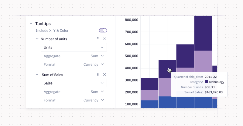
Still seeing the old UI? Just switch from Manual to Auto mode to reset and unlock all the new goodies.
Other improvements
- Faster package installs: Use !uv pip install instead of !pip install for package installs that are 10-100x faster. ⚡
- Hide chart titles: You can now toggle off x- and y-axis titles, facet titles, and legend titles directly in the UI. Say goodbye to hacks like adding a space to hide titles.
- Drag columns from tables in explorations: Just like from the sidebar, you can now drag and drop column headers from tables into drop zones to configure an exploration.
- Link from published app cell to notebook cell: From the three-dot menu of a cell in a published app, you can click “View in notebook” to jump straight to the corresponding cell in the notebook — no scrolling needed!
- Allow empty dropdowns: You can now make dropdown inputs optional. Instead of forcing a default selection or creating a “None” option, just toggle on “Optional” to let users clear the selection and reset the value to null. All existing dropdowns will stay required and behave as they have before.
- File upload improvements: Got more CSVs to add? Drop them into the Files sidebar, even if there are already files there. We also changed the default sort so your most recent uploads show up right at the top.
- Export Snapshots as a PDF: You can now export full Snapshots directly as PDFs to share with your stakeholders.
- Enhanced run stats: View run stats in debug mode for published apps; see SQL cell query execution times, connection times, and cache retrieval times; identify execution type of non-code cells in the run stats panel; and hover over a SQL query to see the result set size in a tooltip.