Chart cells
Chart cells let you visualize and explore the dataframes in a Hex project, without writing code.
We released a new version of Chart cells in October of 2025. Chart cells created before this change are considered legacy and don't have some of the features mentioned in this doc, like support for semantic models or calculations. See below for info on how to upgrade legacy Chart cells.
- Users will need Can Edit permissions to create and configure Chart cells.
- Users with Can Explore permissions can explore from Chart cells in a published app.
- Users with Can View App permissions and higher can view Chart cells in published Apps.
Chart cells allows users to interactively explore and aggregate data, creating rich visualizations to share with app users.
Users can filter data with chart interactions. Selecting points of interest in a chart returns a filtered dataframe, which can be referenced downstream in the project. Users with Can Explore access or higher to a published app can explore from Chart cells in the app.
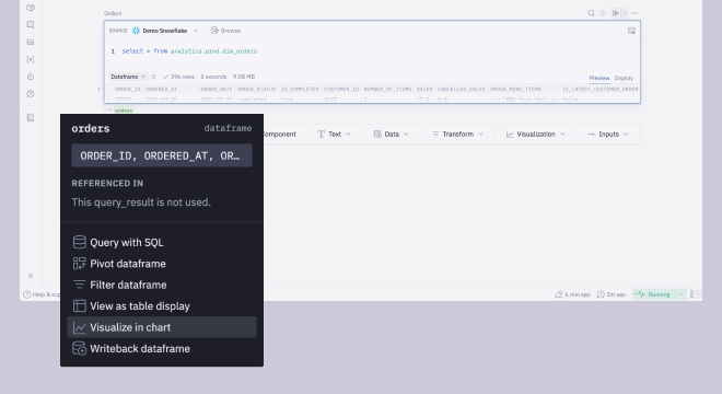
Adding a Chart cell
Add a chart cell to your project by:
- Selecting Chart from the Add cell menu bar.

- Choosing Visualize in chart in the dataframe menu.
Configuring a Chart cell
- Choose the data source (dataframe, semantic model, or warehouse table) you'd like to visualize with the Data input.
- Choose the chart type in the Type input. The following chart types are supported:
- Column charts
- Grouped column
- Stacked column
- 100% stacked column
- Bar charts
- Grouped bar
- Stacked bar
- 100% stacked bar
- Line & area charts
- Line
- Area
- 100% stacked area
- Other
- Histogram
- Scatter plot
- Pie chart
- Column charts
- Map the columns in your data source to the axes of your chart in the Data tab of the configuration panel
- Apply styling as desired under the Style tab of the configuration panel
Set time units for dates and timestamps
Date and timestamp columns can be truncated to a time period (e.g. hour, day, month) when added to a chart. When combined with an aggregate function, this allows chart editors to interactively explore data at different time grains.
If you've set a column's time unit to Week, a Week start option will be displayed in the column's configuration options. This lets you customize the start of the week to Monday or Sunday, depending on your business's needs. It's also possible to set the Week start setting when a chart has been set to facet by a week-truncated column.
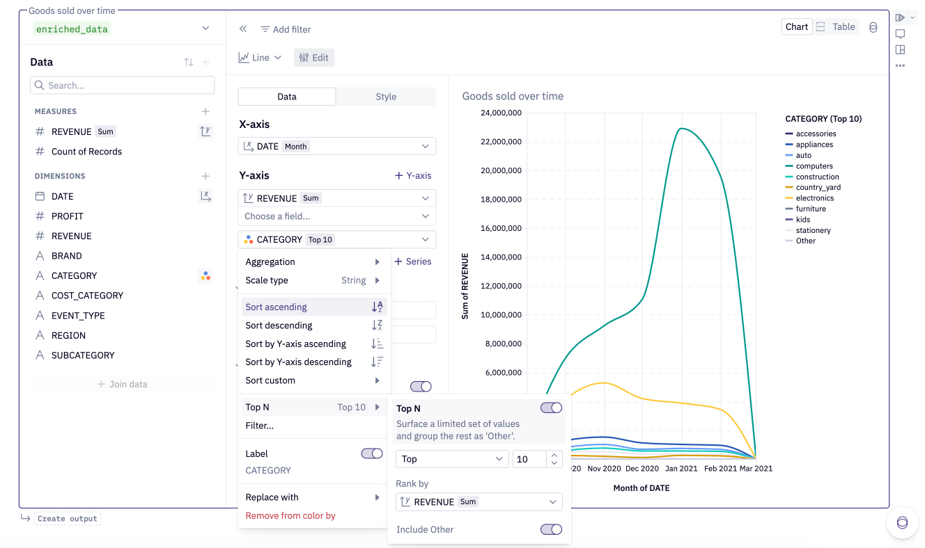
Top N
Top N allows you to focus on your most significant data by displaying only the most important values in your visualizations. When working with datasets containing many unique categorical values, Top N helps you simplify your visualization by showing only the top (or bottom) data views based on a measure you select.
Using Top N
Apply directly to a field with string scale type in charts (base-axis, color, facet) or pivots (row, column).
You can be found Top N in two places:
- Field entrypoint
- Filter entrypoint
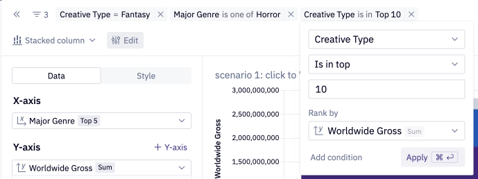
When configuring Top N, you have several options:
- Direction: Choose between "top" or "bottom" values
- Count: Specify the number of values to display (N)
- Rank by: Select which measure to rank your values by
- By default, ranks by the first y-axis measure (charts) or first values measure (pivots)
- Can also rank by other measures or aggregated dimensions
- Other bucket: Toggle to include or exclude an "Other" category that combines all remaining values
Top N is applied after other aggregations and filters but before sorting and rendering. Multiple Top N configurations can be applied to different dimensions. For large datasets, Top N can significantly improve visualization performance.
Aggregating data
Hex's chart cells allow you to apply pre-built aggregates to your rows, such as sum, count and max functions. This provides an interactive way to explore data when grouping by different columns, without having to reshape the data upstream.
The chart cell can take any size of dataframe or warehouse table as input, but can only render 10,000 data points per series after aggregates and time-truncation are applied.
Applying the aggregation within the chart cell (as opposed to performing aggregations upstream in the project logic) means the cell holds the row-level data, which makes the cell very useful to explore from if it is included in a published app.
If you'd like to define a custom aggregate, you can do so by defining a calculation.
Calculations
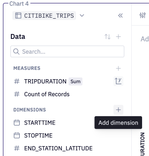
To add a calculation, click the + next to Dimensions or Measures in the field picker, or click + in the table below the exploration.
Function definitions, supported syntax, and rules can be found here. Once a calculation is defined, it can be added to a visualization or table, like any other column.
Calculations that use aggregation functions like Sum(), Count() will be represented as measures, and can be used with grouped fields to compare statistics between categories, or over time.
If your cell has a join configured, calculations are currently only able to reference columns in the base table.
Color by a column
For most chart types, you can specify a column to break out and color your data by.
This column will be represented as entries in your legend, with each value rendered with a different color.
Change a column's scale type
Columns in a chart will render as one of three scale types: string, number, and datetime. The scale type is indicated via an icon in-line with the column name. These types are inherited from the source dataframe, and impact how the data is rendered.
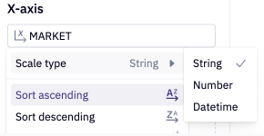
At times, you may need to override a column's type to ensure your chart renders correctly. You can do this by selecting the scale type icon to switch it. This most commonly required when an upstream field is not correctly being interpreted as a datetime type.
Alternatively, consider changing the datatype upstream, for example by casting the column to a timestamp type with dataframe SQL (see the DuckDB docs on timestamp functions for more information).
select
  strptime(release_date, '%b %d %Y') < '2010-01-01' as release_date,
  * exclude (release_date)
from movies
This will ensure any cells downstream of your dataframe treat the data correctly.
Ordering data
The chart cell offers a number of options for ordering your data:
- Axes that plot a
numberordatetimevariable can be sorted in ascending or descending order. - Axes, colors, and facets that plot a
stringvariable can be sorted:- In alphabetical order (ascending or descending).
- In order from least to most (Y-axis ascending) or most to least (Y-axis descending).
- In a custom sort order.
- When using multi-series charts, series can be reordered via drag and drop interactions.
Plot multiple columns in a Chart cell
Hex offers three ways to plot multiple columns from a dataframe in a chart cell: adding data to a series, adding a series or adding a second Y-axis.
- Adding a column to a series: This option is useful if the columns should be plotted as a set of grouped or stacked columns or bars, or stacked areas, although it can be used for line and scatter series as well. The series can be either colored or faceted by column.
- Adding a series: This option is useful if the two columns should be plotted on the same axis, and share the same unit of measurement, for example comparing revenue and profit. Any number of columns in your dataframe can be added to a chart this way. To add a series, click the + Add series button from the Data tab.
- A chart can have any number of line or scatter series, but at most one (vertical) column series and one area series.
- Series cannot currently be added to (horizontal) bar charts, pie charts or histograms, and such series cannot be added any chart with an existing series.
- Adding a second Y-axis: This option is useful if the two columns should be plotted on different axes, and reflect different units of measurement, for example comparing revenue (in dollars) and number of orders. Only two axes (left and right) can be added to a chart, however each can have multiples series associated with the axis. To add an axis, click the + Add Y-axis button from the Data tab.
Series can be reordered, or assigned to a separate axis, through a drag and drop interaction.
Only columns from the same dataframe can be plotted in chart cells. If you need to chart columns from different dataframes, consider joining the data upstream in Hex. Check out this tutorial for an example.
Faceting
Use faceting in a Chart cell to split your chart into multiple subplots. At the bottom of the Data tab, open the Faceting toggle, and select a column or columns to facet by, vertically and/or horizontally.
If you are only faceting horizontally, you have the option to wrap the subplots, and set the number of subplot columns.
Currently, faceting is not supported for multi-series charts, nor for facets that create more than 100 subplots.
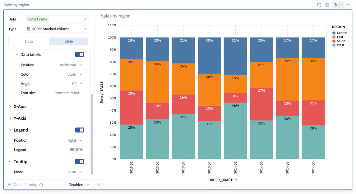
Adding data labels
To add labels to a chart, open the Style heading and toggle on Data Labels. Further styling customizations are possible once the setting is enabled.
For stacked bar, column, and area charts, Total data labels and Per color data labels can be enabled and customized separately.
Reference lines
Reference lines can be added to the X- and Y- axes of charts. To add a reference line to your chart, open the Style tab and click + Add next to Reference lines under the X-axis or Y-axis section. After setting the reference value, optionally adjust the line color, style, and label settings.
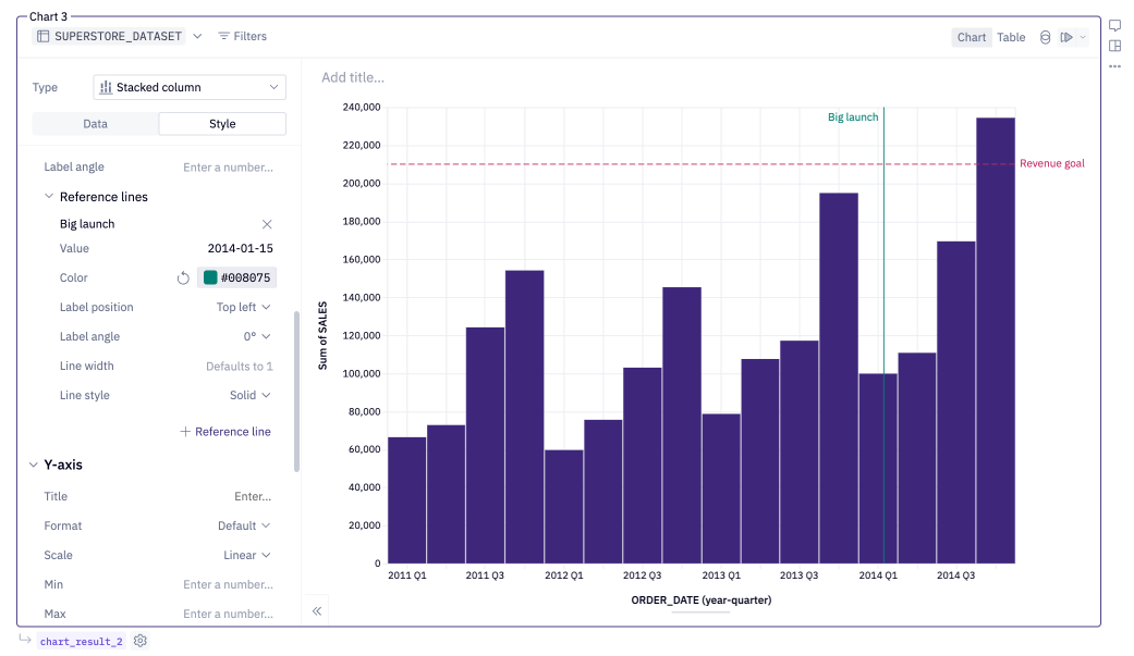
Reference lines are not currently available on the Y-axes of dual Y-axis charts.
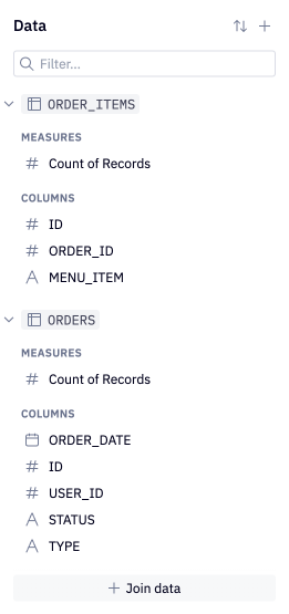
Joins
Joins are only supported for cells that use a database table as their data source.
To join data from another database table, click the + in the upper right of the field picker, or the + Join data button at the bottom of the field picker. This will bring up the Data Browser, from which a target table can be selected.
In the modal, select the columns to perform the join on, and the unique key columns for each table. Hex will make a best guess at what the joining and unique columns should be, but will display a warning if no columns can be detected or if an issue is detected with your selected columns.
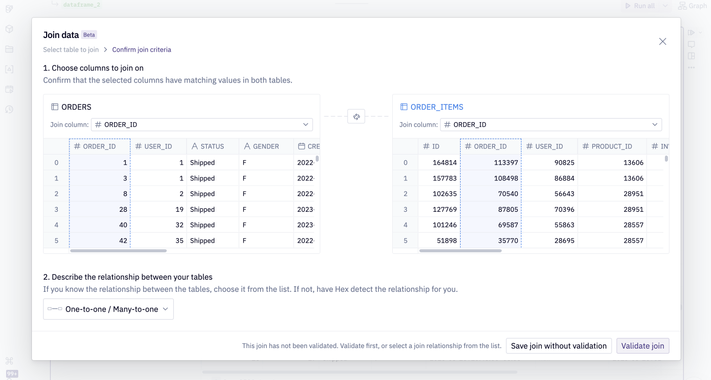
After Join table is clicked, Hex will perform a left join from the base table to the joining table. The columns from the joining table will appear in the field picker.
Once a table is selected, configure which columns to join on and the unique key columns for each table. Hex will make a best guess at what the joining and unique columns should be, but will display a warning if no columns can be detected or if there appear to be any errors with your selected columns. After Join table is clicked, Hex will perform a left join from the base table to the joining table.
Hex will detect duplicate rows that may arise as a result of the join. Using the unique keys specified, Hex can accurately calculate aggregations on the base and joining tables of one-to-one, many-to-one, one-to-many, and many-to-many joins.
If there is a mistake in the join logic, Hex will flag a warning in the join config. If you’d like to proceed with the join, acknowledging that the join may produce inaccurate results, click the down arrow from the greyed out Join table to force join.
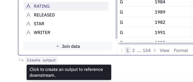
Outputting a Dataframe
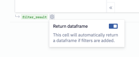
To reference the data from a Chart cell, users can select Create output from the bottom left corner of the cell. This will create a dataframe with a variable name that can be referenced downstream in the project.
By default, the dataframe returned will return data at the row-level grain, with grouped and aggregated rows at the beginning of the dataframe. To have the dataframe only return the grouped and aggregated rows, hover over the explore_result pill and toggle off Include row-level data.
Interactive charts
All Hex charts are interactive in both the Notebook view and Published App.
- Hovering over a legend will highlight the respective data series
- Clicking the legend, or clicking and dragging over a chart area, will select data points of interest
- Users can then choose to keep or remove the records of interest.
- Permissions permitting, users will be able to view the underlying data that makes up the records of interest - see View Data below.
Editors can use the filtered records returned by a Chart cell downstream, enabling powerful drilldown workflows for App Users.
In Notebook view
- Interact with the chart to select data — a full list of interactions can be found below.
- Choose to keep or remove the selection.
Note that cell-level filters applied by Editors in Notebook view do not show up in the Published App, and therefore cannot be altered by a user viewing the Published App. App users are able to add additional filters via chart interactions.
If you choose to return a dataframe, use the returned dataframe in downstream cells, such as Table display cells or another Chart cell.
In Published Apps
In a Published App, users can interact with the chart to add additional filters.
If downstream cells use the returned dataframe, these cells will also be updated by any filters that are added.
Users can only add additional filters in a Published App, and cannot view or edit the cell-level filters applied by Editors in Notebook view.
View Data
This feature is available to workspaces on the Teams tier and higher.
Users with Can Explore permission on a project will be able to View data in a published app to see the individual records that make up selected points from a visualization or a pivot.
From the resulting modal, users can download the data or continue exploring.
In the published app, users can also click on the table icon in the upper right of the cell to view all underlying records of a chart or pivot.
Note that View data is not possible from legacy pivot cells. Upgrade your pivot cell to use View data.
Chart interactions
- Column charts
- Bar charts
- Line and Area charts
- Scatterplots
- Histograms
Selecting a range along the X-axis: Click and drag horizontally within the chart area to select multiple columns.
Selecting individual columns or column segments: Click an individual column (grouped column charts) or column segment (stacked bar charts) to select it. Use shift + click to add additional segments to your selection.
Selecting a legend entry: Click on a legend entry to highlight this series. Use shift + click to add additional series to your selection.
Reset a selection: Click within the chart area to reset your selection.
Selecting a range along the Y-axis: Click and drag vertically within the chart area to select multiple bars.
Selecting individual bars or bar segments: Click an individual bar (grouped bar charts) or bar segment (stacked bar charts) to select it. Use shift + click to add additional segments to your selection.
Selecting a legend entry: Click on a legend entry to highlight this series. Use shift + click to add additional series to your selection.
Reset a selection: Click within the chart area to reset your selection.
Selecting a range along the X-axis: Click and drag horizontally within the chart area to select multiple datapoints.
Selecting a legend entry: Click on a legend entry to highlight this series. Use shift + click to add additional series to your selection.
Reset a selection: Click within the chart area to reset your selection.
Selecting a range of data points: Click and drag within the chart area to select a range of point in any direction. If an aggregate is applied to the Y-axis value, this will create a horizontal range.
Selecting a legend entry: Click on a legend entry to highlight this series. Use shift + click to add additional series to your selection.
Reset a selection: Click within the chart area to reset your selection.
Selecting a range along the X-axis: Click and drag horizontally within the chart area to select a range of along the X-axis.
Reset a selection: Click within the chart area to reset your selection.
Chart style configurations
Customize chart colors
Hex's chart cells provide fine-grained options for choosing colors.
To customize the colors of your chart:
- Open the Style heading, tab of the chart editor open the Color menu. The default color for each series for each bar, line, area or point will be shown.
- Click into the current color to customize it. You can choose a color from:
- Palette: The currently active palette. Workspaces on the Team and Enterprise plan can update the palette used for charts by creating a custom color palette and setting it as the active palette.
- Custom: Use a color from the provided swatches, or set a custom color. To set a custom color, click into the color code, and update it to your custom value. Color values can be formatted as hex strings, such as
#F5C0C0orAD8EB6, or as CSS color names, such asmediumpurple. You can also click on the color swatch to open and select a shade from the color picker.
- To reset your colors to the default palette and ordering, hover over the Color heading, and select Reset colors.
Additional customizations
The Style tab also lets you customize:
- Column, Bar, Line, Area or Point style: Configure options for colors, order and opacity.
- Chart and axis labels: Configure the labels rendered on your chart. By default, this map to the column names configured in the Data tab.
- Axis style: Configure the style, tick count, and minimum and maximum values of your X- and Y-axes.
- Legend (if applicable): Configure whether a legend is displayed, and the position on the chart.
- Tooltip: Configure whether a tooltip is displayed. By default, the tooltip will show the values on the chart. You can further customize the tooltip values by adding custom tooltip entries with the + Tooltip button.
Scrollable charts
By default, charts will fit the height and width of the cell size, but it is possible to override this and make charts scrollable. This is particularly useful for charts with long categorical axes. To enable scrolling, open the Style tab in the chart configuration panel and toggle "Fit width" or "Fit height" off (whether the width or height is fixed will depend on the chart type).

Resize the cell in the app builder in order to fix the size of the viewport that the user will see in the published app.
Chart style copy & paste
It's possible to copy all of a chart's styling to your clipboard and paste matching styles to a second target chart. Styles can be pasted both within and across projects.
The underlying data represented in the target chart will never change when styles are pasted. The style configurations are compared between the source and the target cell, so only "applicable" styles are transferred between cells. See the rules below to understand how Hex determines which styles to transfer over from the source to the target cell:
- General, data-agnostic styles like legend position, fit-width, and font size are always transferred.
- Data-dependent styles such as axis labels and bounds, and number formatting are only transferred if the relevant data matches¹:
- X-axis, horizontal and vertical facets: styles will only be transferred if there is a data match.
- Y-axes: styles will only be transferred if at least one series in the source cell has a data match to one series in the target on the same side (e.g. to copy the left-side Y-axis label and format, at least one series mapped to the left Y-axis in both the source and the target must have a data match).
- Per series:
- Line dash, data labels, etc: transferred from the first series with a Y-axis data match.
- Color styles: copied from the first series with a Color-by data match.
¹Hex considers two fields to be a "data match" when the field name, aggregation (if applicable), and time unit (if applicable) between the source and the target cell are all the same. For example, if the source cell and target cell both have a field called order_date on the X-axis that are both truncated to Month, this would be considered a data match (even if the fields trace back to two different dataframes).
If you want to undo the styles you've recently pasted to the target chart, you can use the "Undo" button in the resulting toast. Alternatively, you can use cmd + z to undo the pasted styles.
Chart cell timezones
If one or both of your chart axes uses a timestamp column, Hex will convert timestamps to a target timezone, rendering them in this timezone. In increasing precedence, this target timezone is set by the workspace timezone, the project timezone, and the app session timezone. See this docs page for more information.
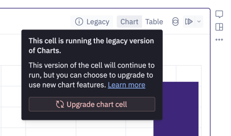
Legacy charts
We upgraded our chart cell in October 2025. Chart cells created before this upgrade are considered legacy.
Chart cells created before October 2025 will still run, but are considered legacy and have a "Legacy" tag that is only visible in the notebook.
New charts hold many upgraded features including the ability to use semantic models, the ability to perform no-code joins on warehouse tables, calculations, integration with our AI agents, top N filtering capabilities, and more. Legacy Chart cells will not receive any of these features nor future ones - to use these features in your existing Chart cells, you can upgrade the cell.
Upgrade legacy Chart cells
To upgrade a legacy Chart cell, hover over the "Legacy" tag to see an option to upgrade the cell. The existing chart configuration, styling, and location in the app builder will be maintained in the upgraded version. If you want to reverse the upgrade, you can cmd+z to undo.
Users will be able to temporarily add new legacy chart cells via the More menu in the add-cell bar.
Beginning in October 2025, it is also no longer possible to create visualizations directly within SQL cells. Existing visualizations that have been configured within SQL cells will continue to run, but are considered legacy and do not have any of the upgraded features described above. If you'd like to use the upgraded features in your existing SQL cell visualizations, hover over the "Legacy" tag to see an option to create a new Chart cell based on the existing one.