Map cells
Map cells let you visualize geographic data in a customizable interactive map.
- Users will need Can Edit permissions.
Add a Map cell
To add a Map cell to your project, locate the the Add cell menu in the Notebook view, then click Visualization and select Map.
Select data for your Map cell
Choose the dataframe that contains your geographic data from the Data dropdown menu in the Map cell.
Map cells can visualize up to 100,000 rows of data per layer. This is a performance limit set by the underlying libraries that are used to render data. If a dataframe containing more than 100,000 rows is selected to populate a map cell, the map cell will issue a MemoryLimit error, and you'll need to reduce the size of the dataset to continue.
Then, choose a layer type from Type dropdown menu in the Map cell. There are four types of layers available in map cells:
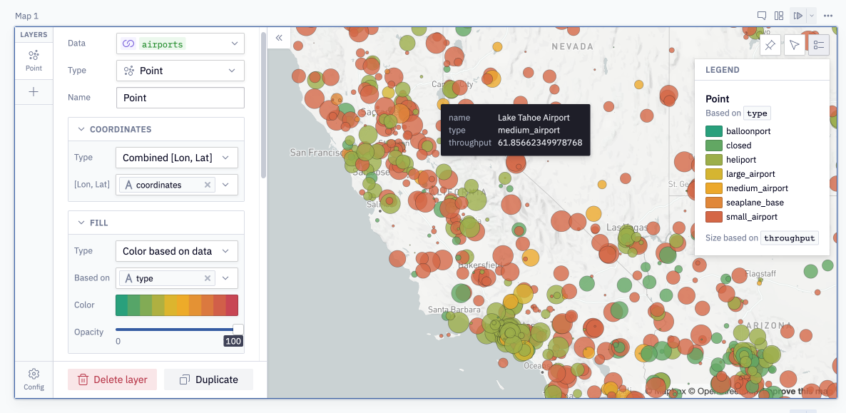
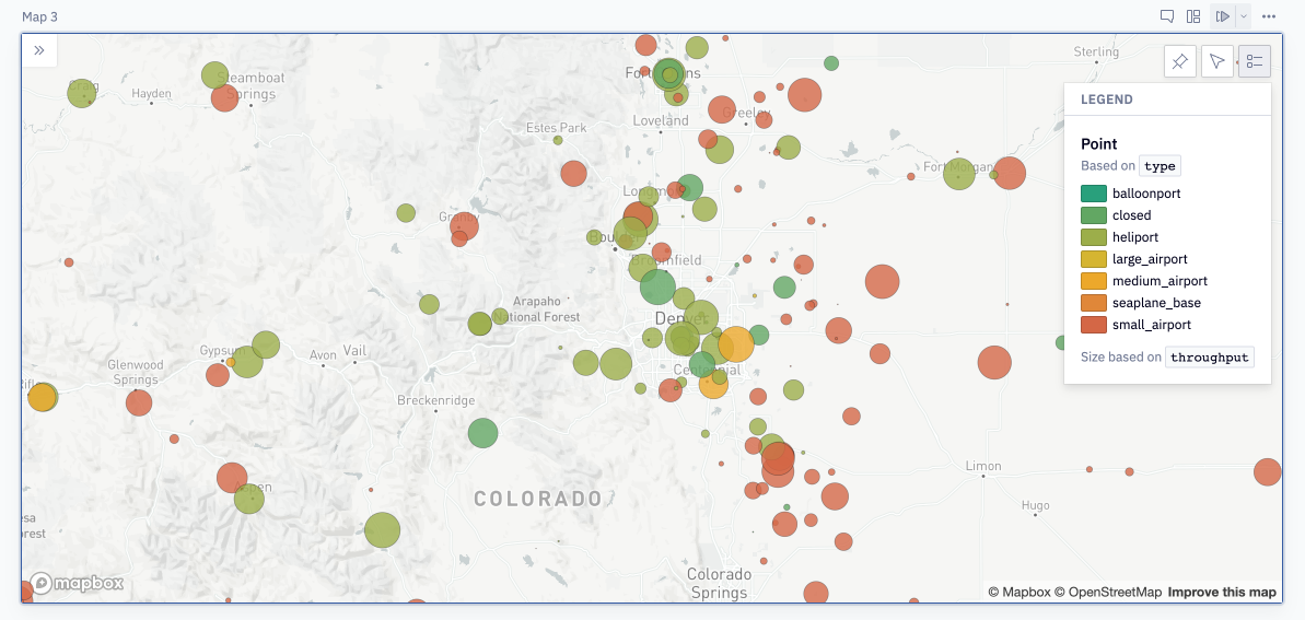
- Point: Rows are represented as individual points on the map. This requires latitude & longitude data for each row. Ex: Where are all the airports in the USA?
- Text: Rows are represented as individual text labels on the map. You can choose which column from a dataframe to use as the label. This requires latitude & longitude data for each row. Ex: What are the names of all those airports?
- Area: Rows are represented as polygon shapes on the map. This requires GeoJSON or WKT data for each row. Ex: How far is the 30-minute driving radius around each airport?
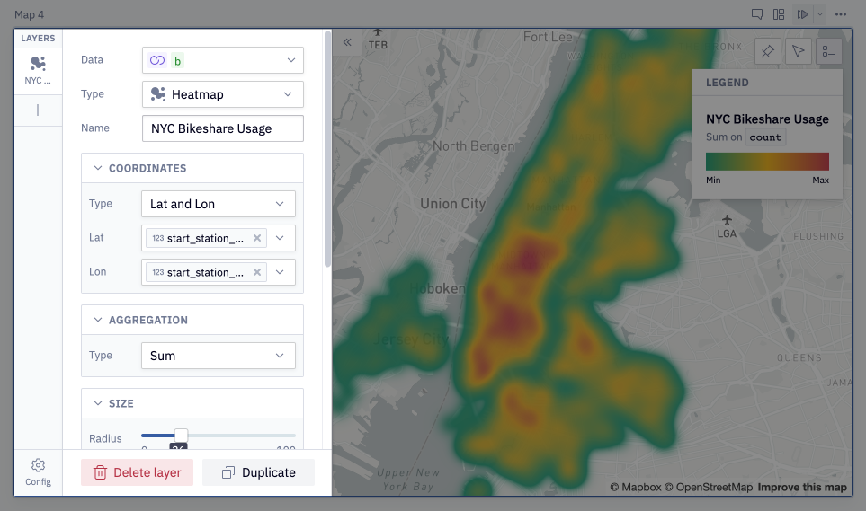
- Heatmap: Rows are aggregated based on geographic density and represented collectively as a heatmap. This requires latitude & longitude data for each row Ex: Where is the highest density of small airports?
Once you've added a layer, you can configure how it's rendered on the map, adjusting shape, size, transparency, and more. See the map configuration section below for more details.
You can also add multiple layers to one map, visualizing many different kinds of data. Imagine a map that answers the question "How many regular customers live within a 2 mile radius of our store?". You'd have a point layer (customers), another point layer (the store), an area layer (2 mile radius), and maybe a text layer (labeling the store).
Map configuration
Different map layers have different configuration options, accessible from the configuration panel. Layers can be reordered in the far left side of the configuration panel to adjust their front-to-back ordering on the map.
All map layers require you to configure:
Data: Specify the dataframe you'd like to visualize. This dataframe must have some form of latitude/longitude data or geographic data in GeoJSON or WKT format.
Type: Specify the type of layer to create (Point, Text, Area, Heatmap). See below for detailed descriptions of each layer type.
Name: Specify the name of the layer. This is displayed in the map legend.
Map style: The theme of the base map layer upon which data is rendered. Choose from Light, Dark, Satellite, Streets, or Outdoors. Defaults to the user chosen theme setting (Light/Dark).
Point layer config
Point layers represent rows as individual points on the map, which can be sized and colored based on data. This requires latitude & longitude data for each row.
Ex: Where are all the airports in the USA?
Coordinates: Select the column(s) from the dataframe that contain the latitude & longitude of the points. There are three options for the data's shape:
- Lat and Lon: Used when latitude and longitude are stored in separate columns. You'll be prompted to choose two different columns, one for Lat and one for Lon.
- Combined [Lat, Lon]: Used when latitude and longitude are stored in one column, in lat, lon order. Data can be formatted as any of
(lat,lon),lat,lon,[lat,lon]. - Combined [Lon, Lat]: Used when latitude and longitude are stored in one column, in lon, lat order. Data can be formatted as any of
(lon,lat),lon,lat,lon,lat. This is the most common method of storing geographic data.
If you aren't seeing any points rendered on the map, try switching from lat,lon to lon,lat (or vice versa).
Fill: The color that fills each point. This configuration can be toggled off entirely, leaving points transparent.
- Type: Select "Single color" to use one color for every point, or "Color based on data" to color points based on attributes from the data.
- Based on: If coloring based on data, select a column to color by. You can then choose a color gradient or palette from the color picker.
- Opacity: The opacity/transparency of the fill color. This is visually helpful when points overlap, and a value around 80% is generally recommended.
Outline: Points can have colored outlines around each point. This configuration can be toggled off entirely, removing outlines.
- Color: The color to use as an outline
- Width: The width, or thickness, of the outline around each point.
Size: The size of each point can be set manually or be based on data.
-
Type: Select "Single size" to size all points the same, or "Size based on data" to size points based on attributes from the data.
-
Scale: Choose the scale to apply to point size. If the attribute you are sizing by is very large or very small, this can help scale the data up or down so that it's more easily mapped.
Visibility: The opacity of the entire layer. This configuration can be toggled off entirely, removing the layer from the map.
Tooltip: Tooltips are displayed upon mouseover of a point, and can contain any information from the layer's dataframe. Use the "Fields" multi-select to choose which fields to display in the tooltip. If "Fill"" is turned off, tooltips will only be displayed upon mouseover of a points outline.
Text layer config
Text layers represent rows as individual text labels on the map. You can choose which column from a dataframe to use as the label. This requires latitude & longitude data for each row.
Ex: What are the names of all those airports?
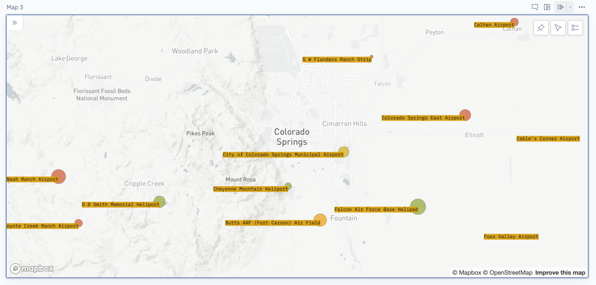
Coordinates: Select the column(s) from the dataframe that contain the latitude & longitude of the points to add labels for. There are three options for the data's shape:
- Lat and Lon: Used when latitude and longitude are stored in separate columns. You'll be prompted to choose two different columns, one for Lat and one for Lon.
- Combined [Lat, Lon]: Used when latitude and longitude are stored in one column, in lat, lon order. Data can be formatted as any of
(lat,lon),lat,lon,[lat,lon]. - Combined [Lon, Lat]: Used when latitude and longitude are stored in one column, in lon, lat order. Data can be formatted as any of
(lon,lat),lon,lat,lon,lat. This is the most common method of storing geographic data.
If you aren't seeing any text rendered on the map, try switching from lat,lon to lon,lat (or vice versa).
Text:
- Label: The column from the dataframe that contains the value to display on the map.
- Color: The color of the text.
- Anchor: The horizontal positioning of the text relative to the centerpoint, either Left, Center, Right. Useful when rendering a point layer and a text layer, to offset the text from the point.
- Alignment: The vertical positioning of the text relative to the centerpoint, either Bottom, Center, Top. Useful when rendering a point layer and a text layer, to offset the text from the point.
- Backdrop: The color to use as a backdrop for each piece of text on the map. Useful to make text more readable on crowded maps.
- Size: The font size of each label. Size does not change when zooming in or out of the map.
Visibility: The opacity of the entire layer. This configuration can be toggled off entirely, removing the layer from the map.
Tooltip: Tooltips are displayed upon mouseover of text, and can contain any information from the layer's dataframe. Use the "Fields" multi-select to choose which fields to display in the tooltip. If using a Text layer to render labels for a Point layer, it's recommended to configure a tooltip for only the Point layer.
Area layer config
Area layers represent rows as polygon shapes on the map, like states, countries, or custom shapes. This requires either a text representation of a geographic region (eg: Country names/codes, state names, counties) or a geospatial representation of a polygon in GeoJSON or WKT format.
Ex: Which county has the lowest unemployment rate? Ex: Which of our stores are nearest to national parks?
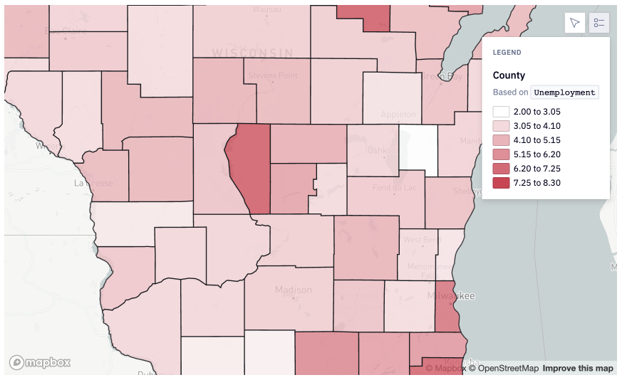
Area: This lets you choose the column from the dataframe that contains geographic information about what to display on the map.
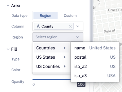
-
Data type: Either "Region" or "Custom". Region allows you to map data using standard representations of common regions like states and countries. Custom allows you to map completely custom polygons.
-
Column: (Region only) The column from your dataframe containing geographic information (eg: 'United States of America','Morocco' or 'New York','California').
-
Region: (Region only) The predefined map region to join your selected Column with. Each region can join on data formatted in several ways. Available options with examples of acceptable data:
- Countries (postal: US, iso_a2: US, iso_a3: USA)
- US States (name: California, two_letter_abbr: CA)
- US Counties (name: Alameda, code (FIPS): 001)
- More regions are on the way! Reach out to [email protected] if you work with a region not listed here.
-
GeoJSON/WKT: (Custom only) The column from the dataframe that contains geographic information about what to display on the map. Each row must contain either a GeoJSON string or a Well-known text (WKT) geometry. Most Python geospatial libraries and SQL GIS functions return data in one of these two formats. For examples of what data in these formats looks like, visit the links for each type.
Fill: The color that fills each area polygon. This configuration can be toggled off entirely, leaving them transparent.
- To use one color for every area, set "Type" to "Single color" and select a color from the color picker.
- To color areas based on attributes from the data, set "Type" to "Color based on data", and select a column to color by from the "Based on" dropdown. You can then choose a color gradient or palette from the color picker.
You can also set the fill opacity, which is visually helpful when areas overlap.
Outline: Areas can have colored outlines. This configuration can be toggled off entirely, removing outlines.
- Color: The color to use as an outline
- Width: The width, or thickness, of the outline around each area.
Visibility: The opacity of the entire layer. This configuration can be toggled off entirely, removing the layer from the map.
Tooltip: Tooltips are displayed upon mouseover of text, and can contain any information from the layer's dataframe. Use the "Fields" multi-select to choose which fields to display in the tooltip. If "Fill"" is turned off, tooltips will only be displayed upon mouseover of an areas outline.
Heatmap layer config
Heatmap layers aggregate rows from the data and represent them collectively as a heatmap of the density of points. This requires latitude & longitude data for each row, just like a point layer.
Ex: Where is the highest density of small airports in the bay area? Heatmaps can be very useful when a map is being used to show overall trends rather than locate discrete points.
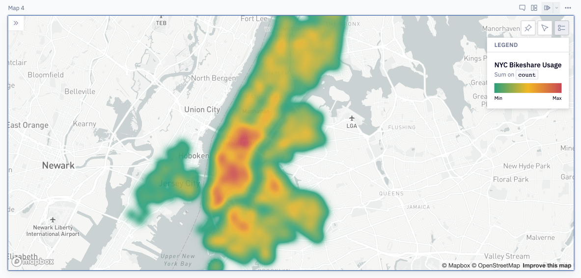
Coordinates: Select the column(s) from the dataframe that contain the latitude & longitude of the points to map. There are three options for the data's shape:
- Lat and Lon: Used when latitude and longitude are stored in separate columns. You'll be prompted to choose two different columns, one for Lat and one for Lon.
- Combined [Lat, Lon]: Used when latitude and longitude are stored in one column, in lat, lon order. Data can be formatted as any of
(lat,lon),lat,lon,[lat,lon]. - Combined [Lon, Lat]: Used when latitude and longitude are stored in one column, in lon, lat order. Data can be formatted as any of
(lon,lat),lon,lat,lon,lat. This is the most common method of storing geographic data.
If you aren't seeing anything rendered on the map, try switching from lat,lon to lon,lat (or vice versa).
Aggregation: The type of aggregation to perform on the data. Either Sum or Mean.
Fill: The color palette used for the heatmap.
- Type: Select "Color based on data" to create a heatmap. Only use "Single color" if you are looking for a broad visual highlight for an area that you do not have Area type geographic data for.
- Based on: If this is left empty, the heatmap will be based exclusively on point density. If you would like to use an attribute from the data to "weight" the heatmap intensity, select that attribute here.
- Color: The palette or gradient to use for the heatmap. The default is recommended for the best contrast. Gradients that fade through white are not recommended.
- Opacity: The opacity/transparency of the heatmap color.
Size: The radius of heatmap aggregation, or how many points to include in each aggregated section of the heatmap. Increasing this smooths out the data and results in lower resolution, more aggregated map, decreasing it results in a higher resolution, less aggregated map.
Map controls
These options are accessible from the upper right hand part of the map itself.
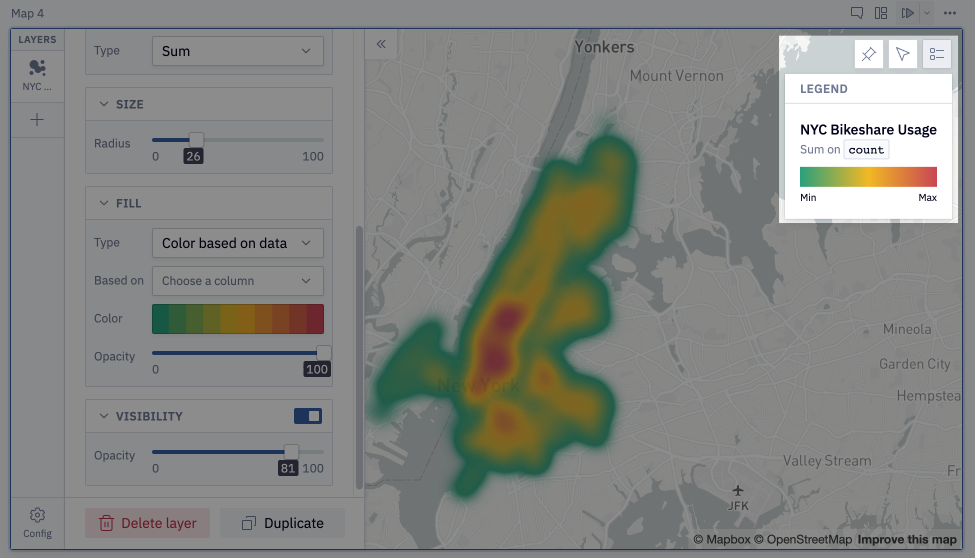
Set default start position
A user with "Can Edit" permissions can choose the default viewport for the map. Published app users can always pan and zoom the map, but whatever the publishing user sets as the "default start position" will always be displayed on app load.
Pan to data
This option lets any map user zoom and pan to a map view that displays all rendered data points. It does not necessarily return to the "default start position", rather zooms out as far as necessary to display every data point.
Legend
The map legend is not customizable, and is automatically generated based on the layers present on the map. On app load, the legend will default to whatever state it was in when published, but users can toggle it on and off from the map.