Create basic Matplotlib plots
Check out the companion Hex project for this tutorial here!
How to create 5 simple plots using Matplotlib
One of the OG visualization libraries, Matplotlib is notoriously flexible (read: requires a lot of customization to get a figure looking exactly how you want it). However, having a basic understanding of Matplotlib is incredibly helpful for using many other standard plotting packages, precisely because it is a lower-level library.
In this demo, we will walk through how to create 5 basic plots using Matplotlib:
- Scatter plot
- Line chart
- Histogram
- Bar chart
- 2D Histogram
You can check out this tutorial’s companion project here to see what this looks like in Hex!
Import the necessary packages
As a first step, create a Python cell and import the following into your project:
import pandas as pd
import matplotlib as mpl
import matplotlib.pyplot as plt
import matplotlib.colors as mcolors
from IPython import display
mpl.rcParams['figure.dpi']= 150
Connect to data
Our next step will be to get some data into Hex! There are two main ways to do this:
-
Uploading a file to your project, or
-
Adding a connection to your database (or using an existing Workspace connection).
For more information about how to get your data into Hex, check out this tutorial!
In this example, we’ll be using the tried and true iris dataset (available here). To get the iris data into Hex, upload the iris.csv file to your project's Files panel.
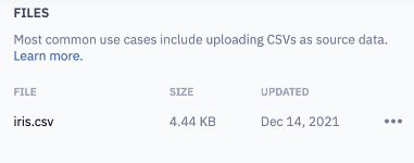
Create a Python cell and define a dataframe, naming each of the columns:
df_iris = pd.read_csv('iris.csv',
names=['sepal_length', 'sepal_width', 'petal_length', 'petal_width', 'class']
)
To get a preview of the data in this dataframe, you can create a Table Display cell based on df_iris:
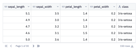
Next, create a list that consists of df_iris’s column names. We'll use this list to populate some input parameters in the next step:
iris_columns = df_iris.columns.tolist()
Let’s give users a way to decide which features of the iris set to visualize. Create three dropdown input cells: x_axis, y_axis, and slice_by. When creating the input cells, set the values to be dynamically generated by the iris_columns list we defined in the previous step.

Scatter plot
Let’s create our first visualization, a scatter plot!
In this example, we’re using the scatter() method to create a scatter plot. Another common method is to use plot() and specify a marker type.
The following code defines a scatter plot:
# create a figure and axis
fig, ax = plt.subplots()

# choose the x and y axes variables from the dropdown variables above
ax.scatter(df_iris[x_axis], df_iris[y_axis])

# set a title and labels
ax.set_title('Iris Dataset', fontsize=18)
ax.set_xlabel(x_axis.replace('_', ' '), fontsize=14)
ax.set_ylabel(y_axis.replace('_', ' '), fontsize=14);
First, we create a figure and axis for the plot.
Next, the values from the input dropdown parameters are used to specify which columns should be used as the x and y axes.
Lastly, we set the plot's title, as well as the axes labels, inferred from the input parameter values.
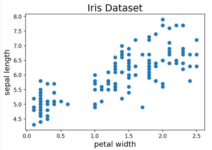
Now let's take this a step further and color-code the data points according to the class of iris. We'll subselect each class from the main dataframe and set a color for each class. In this dataset, there are 3 classes of iris: Iris-setosa, Iris-versicolor, and Iris-virginica.
# create color dictionary
# you can use any of the great named colors listed here (https://matplotlib.org/3.1.0/gallery/color/named_colors.html)

colors = {'Iris-setosa':'rebeccapurple', 'Iris-versicolor':'darkcyan', 'Iris-virginica':'firebrick'}
markers = {'Iris-setosa':'x', 'Iris-versicolor':'.', 'Iris-virginica':'^'}

# plot each class a different color
for c in df_iris['class'].unique():
    plt.plot(df_iris[lambda df: df['class'] == c][x_axis], df_iris[lambda df: df['class'] == c][y_axis],
    marker = markers[c],
    ls='None',
    color=colors[c],
    label = c
    )

# set a title and labels
plt.title('Iris Dataset', fontsize=18)
plt.xlabel(x_axis.replace('_', ' '), fontsize=14)
plt.ylabel(y_axis.replace('_', ' '), fontsize=14)
plt.legend();
First, we create a color dictionary to assign a unique color to each iris class. We also assign a different marker for each class.
Next, we iterate through a for loop, plotting each class with its specified color, marker, and label. By setting ls = 'None', we omit the line connecting the data points from the chart, leaving just the marker for each data point.
Lastly, we set the plot title and dynamically set the axis labels based on the inputs selected by the user.
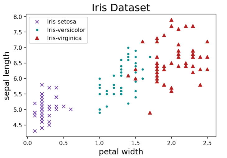
If you want to use interesting colors, check out matplotlib docs for a long list of colors + their names!
Line chart
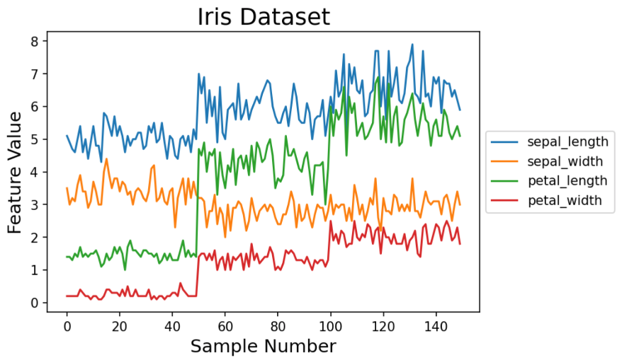
Let’s plot the correlation between different iris features with a line chart. As above, we can plot multiple lines by looping through the features we want to visualize and plotting on the same axis.
A common way to create a line chart is via plot().
# get columns to plot -- do not include "class" column
columns = iris_columns[:-1]

# create a range of the data points to plot
x_data = range(0, df_iris.shape[0])

# create figure and axis
fig, ax = plt.subplots()

# plot each column
for column in columns:
    ax.plot(x_data, df_iris[column], label=column)

# set title and axis labels
ax.set_title('Iris Dataset', fontsize=18)
ax.set_xlabel('Sample Number', fontsize=14)
ax.set_ylabel('Feature Value', fontsize=14);

# move legend outside of plot
ax.legend(loc='center left', bbox_to_anchor=(1, .5));
First, we get the list of columns to plot, excluding the class column.
Then we set x_data to be a range between 0 and the number of rows in our dataframe.
Next we create a figure and axis for the plot, like we did for our scatter plot.
We iterate through a for loop, plotting all of the data points for each column. Each iteration assigns a different color to each line.
Lastly we set the title, x and y labels, and reposition the legend.
Histogram
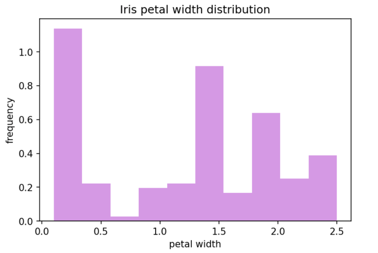
Histograms are created using hist() method. Given a variable, the frequency of values are calculated and plotted.
If you already have the counts of your distribution and thus don't need to calculate it using hist(), you can use bar() instead.
Within hist(), you can normalize your histogram (so the frequency sums to 1) by using density = True . You can also optionally plot the cumulative distribution with cumulative = True.
Let's give end users the ability to choose whether they'd like to apply normalization or plot the cumulative distribution. We can do this by creating two checkbox input cells.

Checkboxes are boolean variables, so if the input cell is checked, the returned value will be True. It follows that if the input cell is unchecked, the value of the variable will be False.
The following will create a histogram based on our df_iris dataframe:
# plot histogram
plt.hist(df_iris[x_axis], density = normalize_histogram, cumulative = cumulative, alpha=0.6, color = "mediumorchid")
# set title and labels
plt.title(f'Iris {x_axis.replace("_", " ")} distribution')
plt.xlabel(x_axis.replace("_", " "))
plt.ylabel('frequency');
The first line plots the histogram based on input from our x_axis dropdown cell, taking into account the user inputs from the checkbox cells (density and normalize_histogram). The alpha and color parameters are being used to customize the style of the plot.
Bar chart
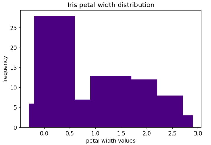
As mentioned above, if you don't need to calculate the frequency of each value with hist(), you can feed those parameters to bar() to create a bar chart.
# count the occurrence of each value
feature_dist = df_iris[x_axis].value_counts()
# get x and y values
points = feature_dist.index
frequency = feature_dist.values
# create bar chart
plt.bar(points, frequency, color='indigo')
# set title and labels
plt.title(f"Iris {x_axis.replace('_', ' ')} distribution")
plt.xlabel(f"{x_axis.replace('_', ' ')} values")
plt.ylabel('frequency')
First we use value_counts() to calculate the frequency of each value of the feature (which the user has selected from the x_axis input cell). The result is a series of the feature values and the calculated frequency.
Next use .index and .values to get the axis labels (x values) and counts (y values).
Use bar() to create the bar chart using the x and y values.
Lastly, dynamically set the title and x axis label, and set the y axis label.
2D Histogram
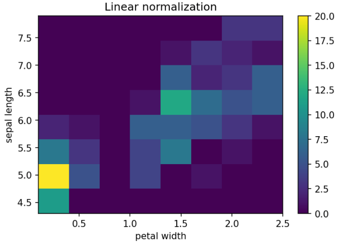
This is a great plot if you want to visualize the density of data. You can create 2D histograms using hist2d().
It's possible to set the number of bins for the x & y axis separately, but for this example, we'll use an equal number of bins for both axes.
Let's create a slider input cell to allow an end user to select the number of bins they'd like to visualize:
Here’s what we’ll use to create the histogram:
plt.hist2d(df_iris[x_axis], df_iris[y_axis], bins=n_bins);
plt.title('Linear normalization')
plt.xlabel(x_axis.replace("_", " "))
plt.ylabel(y_axis.replace("_", " "))
plt.colorbar();
First we use hist2d(), specifying the user-selected x & y axes, and noting the number of bins the user has selected with n_bins.
Then we add a title and dynamically label the x and y axes.
colorbar() adds a colorbar to the plot.
Bonus: Subplots!
While they’re not a type of visualization, knowing how to tile plots as subplots can be very useful.
To create subplots, you can call sublots() to define a figure that consists of the desired number of sub-axes. Each axes (subplot) can then be called individually to plot.
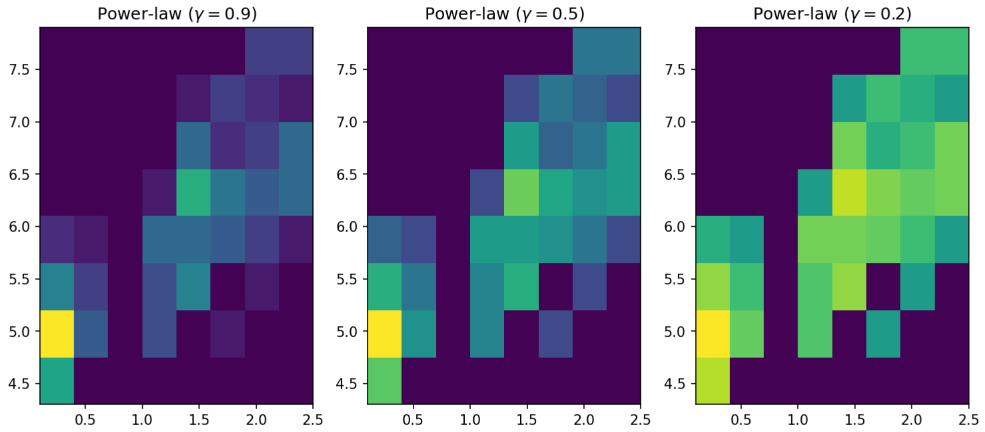
For this example, we’re plotting the same 2d histogram as above, but using a different index for the power-law determining the colorbar normalization in each subplot.
This is the code we’ll use:
gammas = [0.9, 0.5, 0.2]

fig, axes = plt.subplots(nrows=1, ncols=3, figsize=(12, 5))

for ax, gamma in zip(axes.flat, gammas):
    ax.set_title(r'Power-law $(\gamma=%1.1f)$' % gamma)
    ax.hist2d(df_iris[x_axis], df_iris[y_axis],bins=n_bins, norm=mcolors.PowerNorm(gamma))
First, we set the values for the power-law variable, which will determine the colorbar normalization in the subplots.
Next we use subplot() define the figure and axes, as well as the number of subplots to be created.
Then we iterate over the subplots + gamma values, plotting each of the histograms with its own power-law value. We also title each subplot with its corresponding power-law value.
You should now have a solid understanding of how to create some basic plots using the wonderfully flexible Matplotlib! If you’d like to learn how to create more complex plots, try diving into Matplotlib’s super comprehensive documentation for some great ideas and examples.
As a reminder, if you'd like to see these examples directly in a Hex project, check out this tutorial's companion project!